01 / Front
The agent uniform
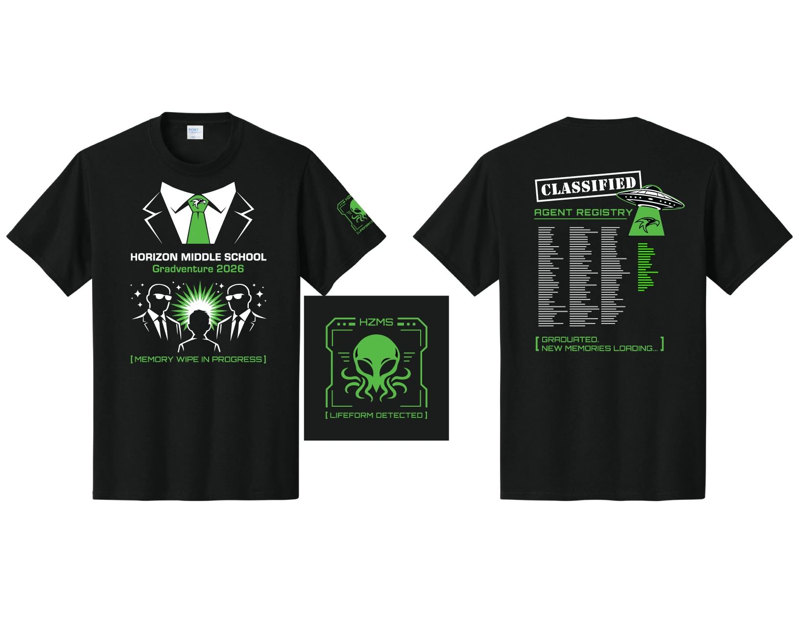
School identity, tailored tie illustration and the memory-wipe composition.
I bring structure to creative work: translating a brief into a plan, keeping people and moving pieces aligned, and carrying the details through to delivery.
A selection of real projects spanning production, events, community programming, client work, and feasibility planning. Built for the next step in project coordination and creative operations.
 Gradventure 2026Production & vendor coordination
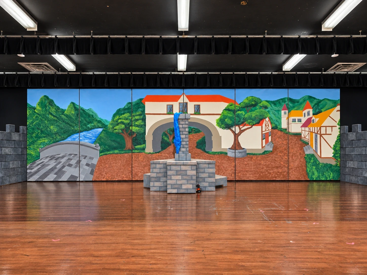 Beauty and the BeastScenic production & stage management
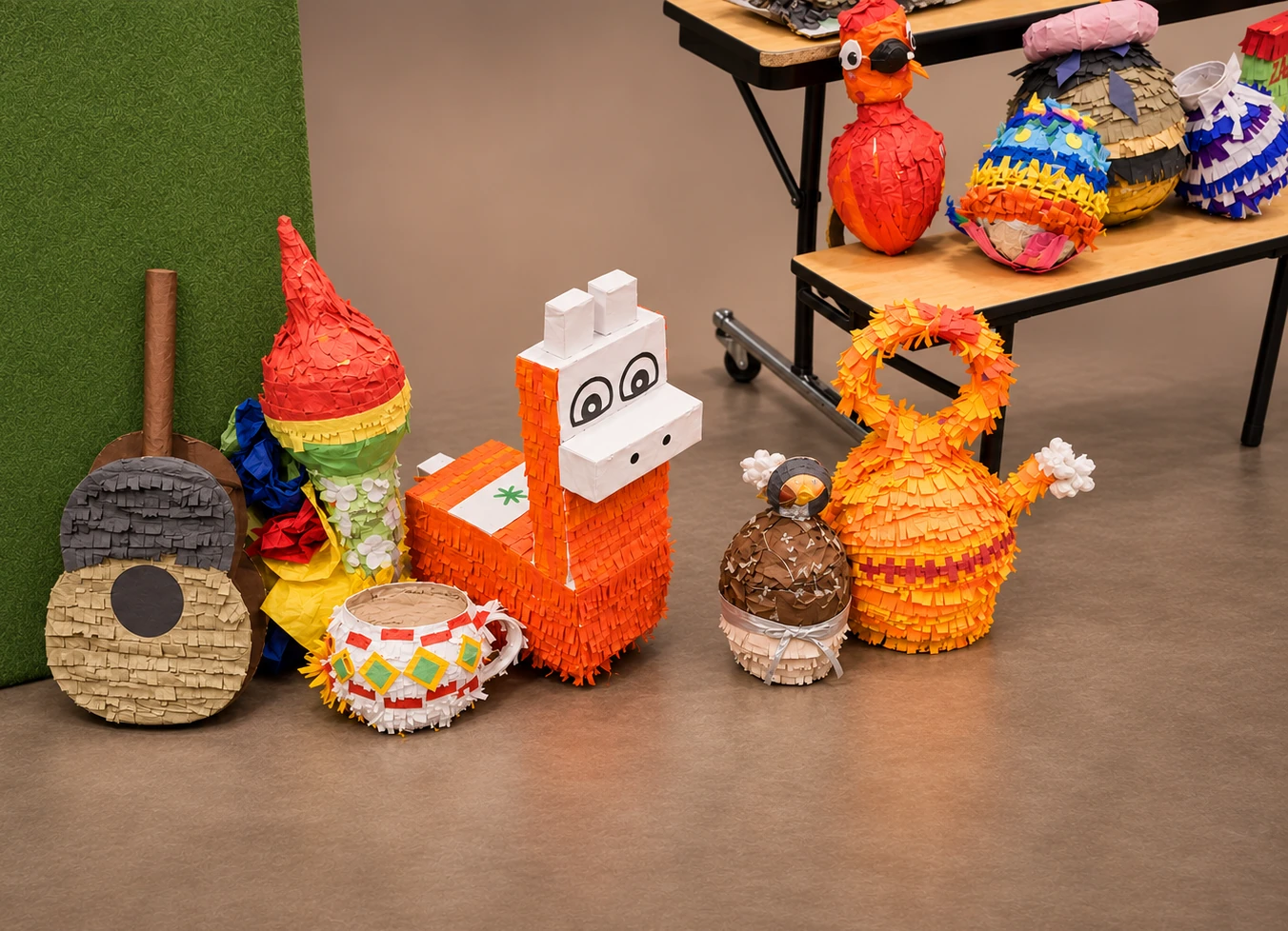 Hispanic Heritage ExhibitionCommunity exhibition & logistics
 Digital CommunityResident programming & communications
01 / Featured case studies
These are the most substantive project stories: they show ownership, collaborators, practical constraints, decisions, and what was delivered.
Apparel & vendor production
An original multi-placement shirt design carried through vendor quotes, revisions, name-list checks, and production handoff.
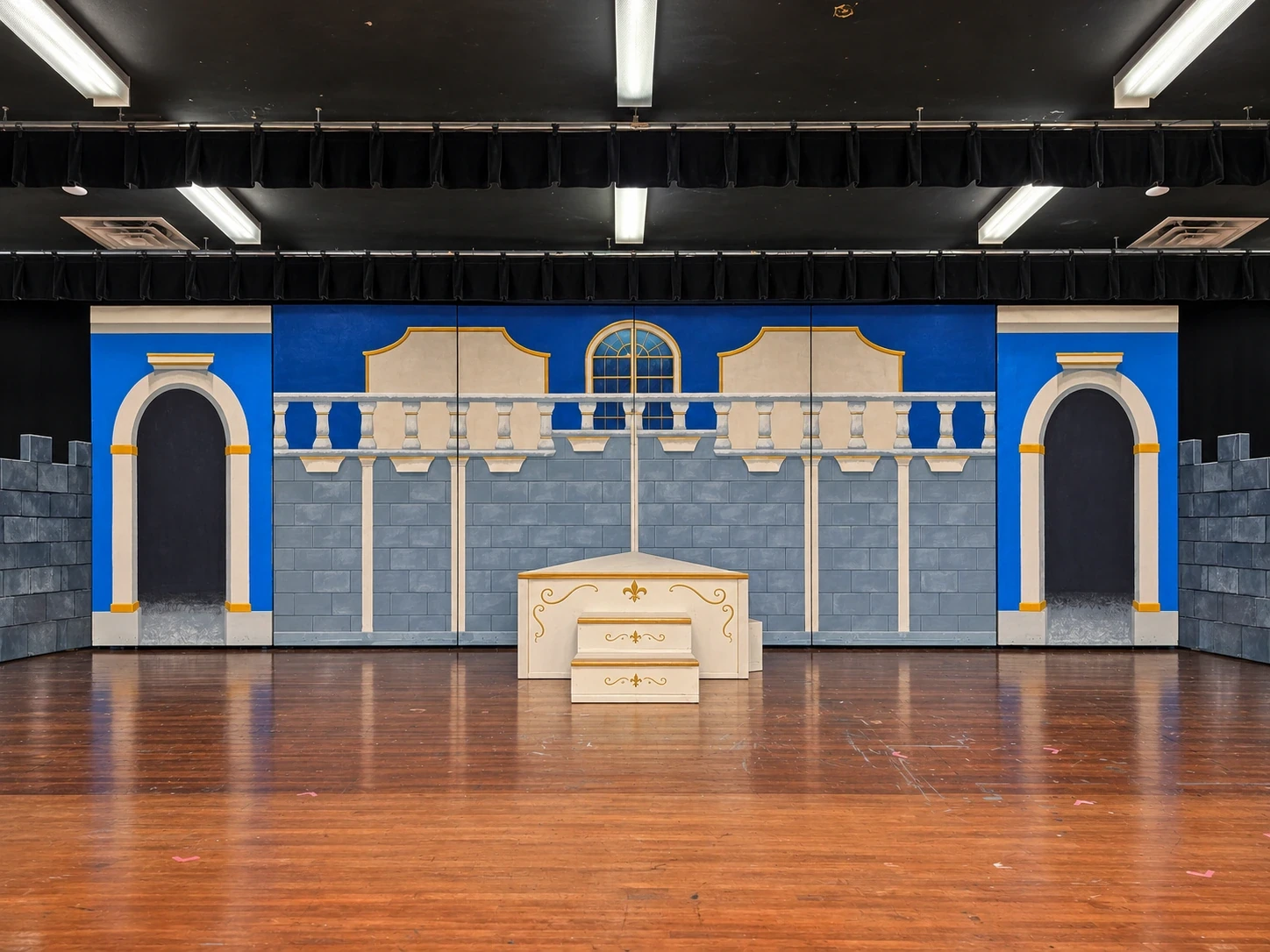
Scenic production & live delivery
Three stage environments developed within a shared rotating scenic system, with painting, helpers, and show-night transitions.
Community engagement & logistics
A student-centered cultural project scaled through donated supplies, clear milestones, material substitutions, and community presentation.
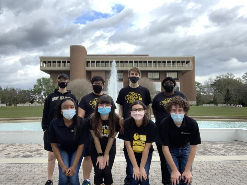
Resident engagement & communications
A shared Discord community and recurring virtual programs built during COVID, later retained as an ongoing housing resource.
02 / Supporting projects
Earlier work selected for the operational thinking behind it, not just the finished visuals.
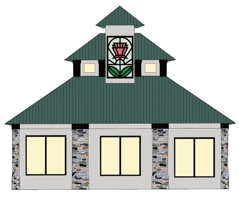
A five-person proposal for a real redevelopment client, combining research, supplier-informed estimates, and original building visualizations.
Explore project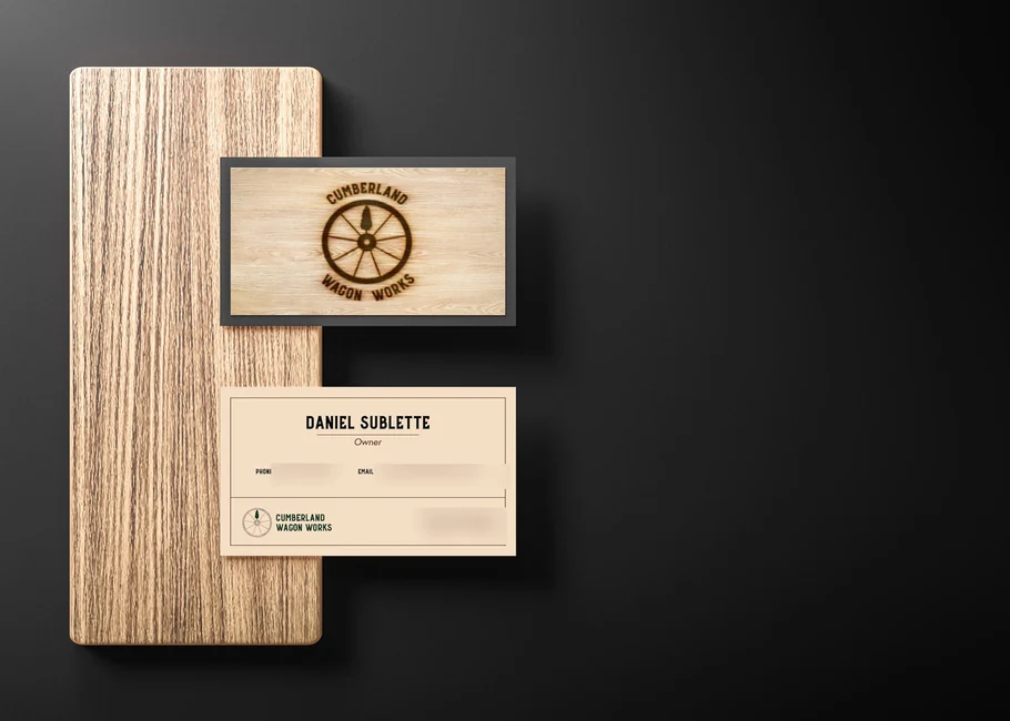
Cumberland Wagon Works, The Pop Parlour, and The Other Side: focused evidence of client discovery, coordinated assets, and digital customer experience.
Explore project03 / How I approach the work
I learned to work across constraints rather than around them, whether those constraints involved budgets, volunteer time, student needs, supplier specifications, or a changing plan.
Turn ambiguous ideas into requirements, choices, milestones, and deliverables that others can understand.
Client surveys · project scaffolds · documented requirementsCommunicate clearly with vendors, volunteers, students, families, or teammates and adjust information for the audience.
Outreach campaigns · cross-team updates · vendor proofingCompare options, use available resources carefully, troubleshoot shortages, and make the next handoff easier.
Cost comparisons · resource substitutions · production sequencing04 / About
I'm a visual arts educator with a BFA in Graphic Design. In my work, I've owned independently run projects, led student and volunteer contributions, communicated with families and vendors, created planning materials, and translated complex ideas into experiences people can use.
I'm pursuing project coordinator, creative coordinator, and marketing operations roles where that blend of visual literacy, research, communication, and delivery can make a meaningful contribution.
Based in Central Florida · Interested in remote and local opportunities
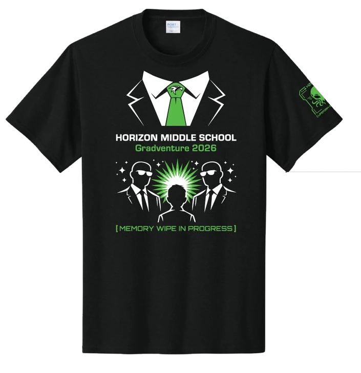
I created a three-location Gradventure design and worked across vendor pricing, production files, roster changes and approvals to bring it into print.
01 / The brief and ownership
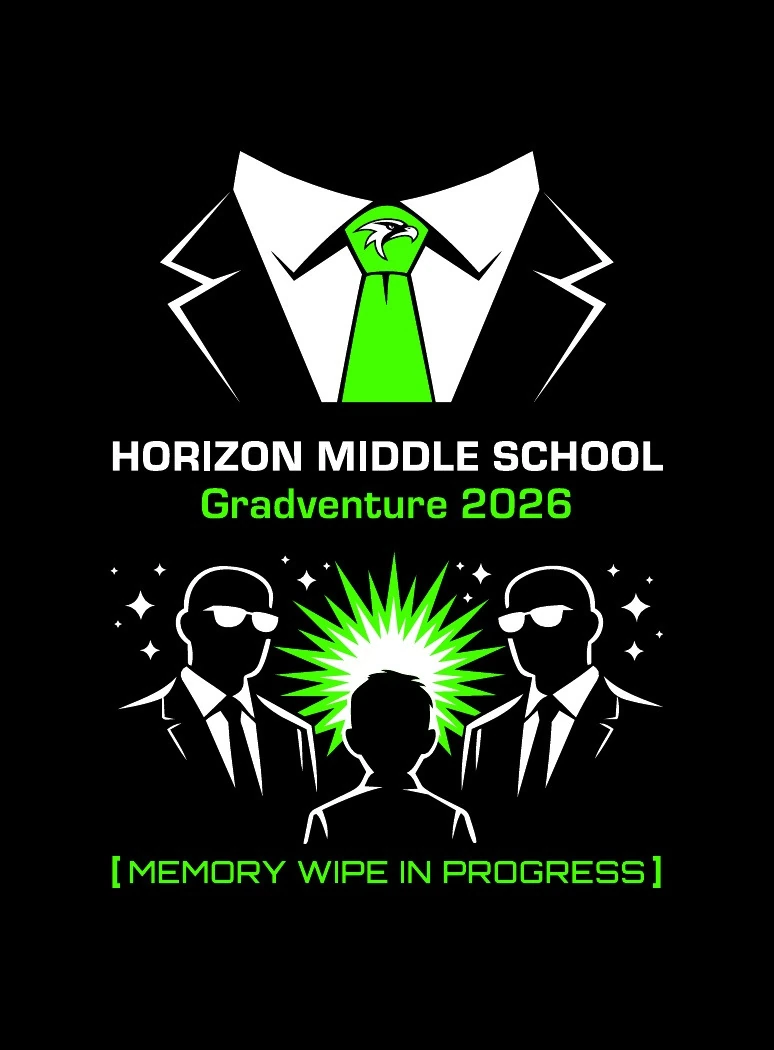
Horizon Middle School needed an eighth-grade Gradventure shirt that felt distinctive, recognizable and appropriate for both students and accompanying staff. I built a secret-agent concept with a consistent black, white and neon-green visual language across the front, back and optional sleeve.
The design needed to accommodate a student and chaperone name registry, fit real print specifications and stay adaptable while payment collection and chaperone decisions were still underway.
I developed the artwork, organized the Illustrator files, communicated technical requirements with the vendor, compared print options and handled roster revisions before supplying the updated art.
02 / Concept development
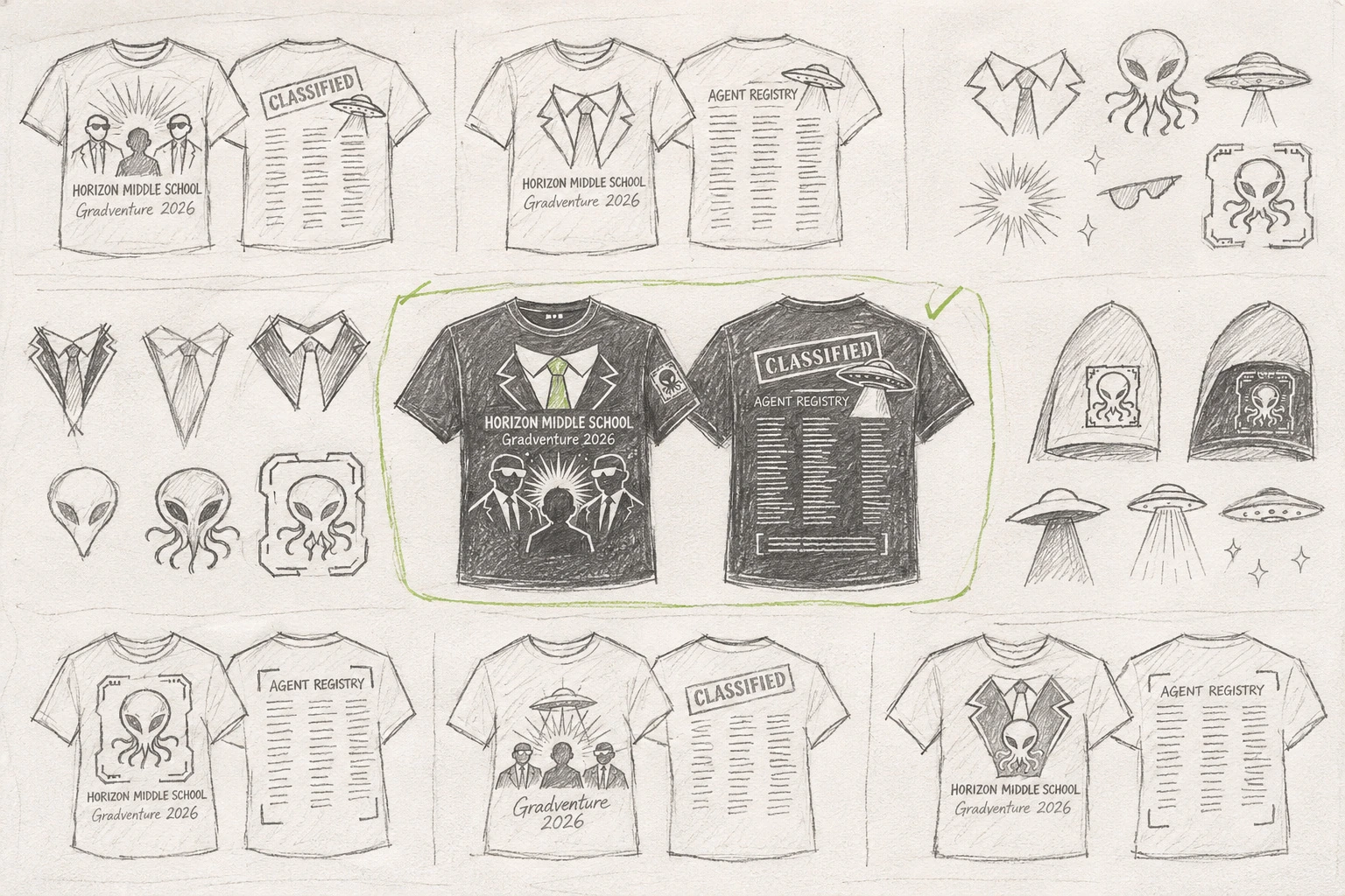
The design exploration combined tailored suits, agency insignia, a memory-wipe scene, a classified registry and extraterrestrial iconography. The chosen direction let each location contribute to the same story.
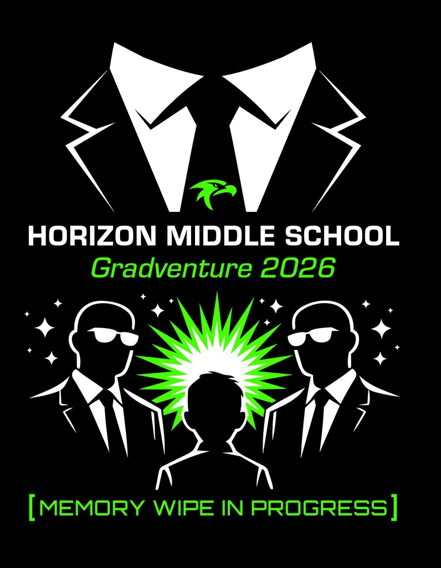
The agent-uniform device helped anchor the front while the lower three-person scene became the primary storytelling image.
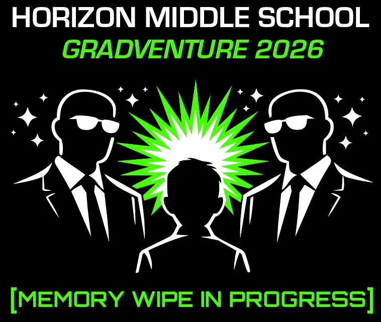
High contrast, simplified silhouettes and green accents kept the graphic recognizable at a distance.
03 / Print artwork
The production file used separate Illustrator artboards for each print location. The approved configuration specified two-color front and back printing, with a one-color sleeve design.
School identity, tailored tie illustration and the memory-wipe composition.
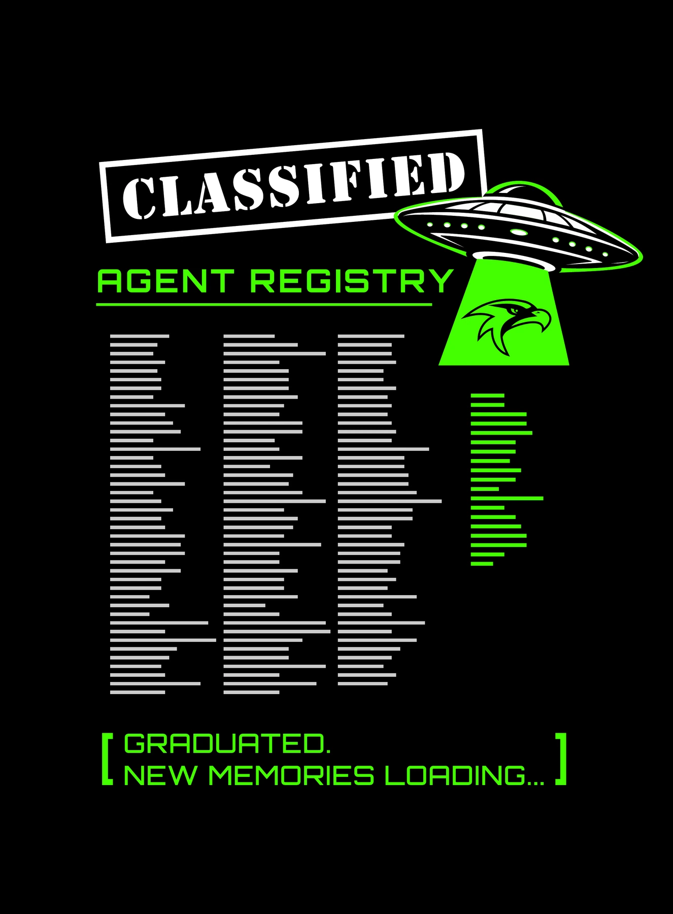
UFO motif, name columns and a strong hierarchy built around “CLASSIFIED.”

One-color mark designed as a smaller supporting detail.
The names in the publicly displayed back artwork are concealed. Original production artwork and name files were exchanged directly with the vendor.
04 / Production decisions
My correspondence with the production vendor turned a creative concept into managed production. I clarified file formats, compared print options, and tracked roster approvals so the final artwork was ready for an accurate handoff.
I provided three original Adobe Illustrator artboards. The vendor's request for vector files avoided its normal artwork placement and reformatting charges.
I asked for pricing with and without the sleeve so the trip lead could judge the added print location against available funds.
I formatted and alphabetized the registry, requested review and applied changes before releasing the final name list to the printer.
“Could you please include 2 quotes for us, one including the sleeve design, and one without?”
March 5 / Vendor estimate for 150 shirts
Two-color front and back imprint
Adds a one-color sleeve imprint
The comparison reflects preliminary quotes, not the final invoice. Larger shirt sizes and the final quantity were priced separately in the later acknowledgement.
05 / Handoff & delivery
The artwork was ready before the student and chaperone roster was finalized. I kept the file responsive to those changes while the grade-level lead worked with the school's purchasing process.
Front, back and optional sleeve were separated into Illustrator artboards, ready for vendor use.
I checked the names layout with the trip lead, applied removals and additions, and sent revised art on March 31.
The lead finalized sizes and confirmed the sleeve option. The school financial office processed the PO.
The printer confirmed the art was ready for an official factory proof after the purchase order.
Production record: vendor acknowledgement AS84005312B.
Roster QA / March 30–31
The registry was organized into columns and reviewed against the final trip list before release. I alphabetized chaperones, checked where administrators belonged and applied the additions and removals provided by the trip lead.
The names shown in this portfolio view are concealed. The vendor received the completed list in the final production file.
06 / Production timeline
The project began with design exploration in February, continued through print decisions and approvals, and concluded with distribution before the May 1 trip.
Explored front, back and sleeve concepts.
Final vector direction prepared.
Two printing options priced.
162 sizes and the sleeve option supplied.
Updated names and artwork sent.
Purchase order sent; proof process advanced.
Shirts arrived and were sorted into student groups.
Eighth-grade trip took place.
07 / Outcome
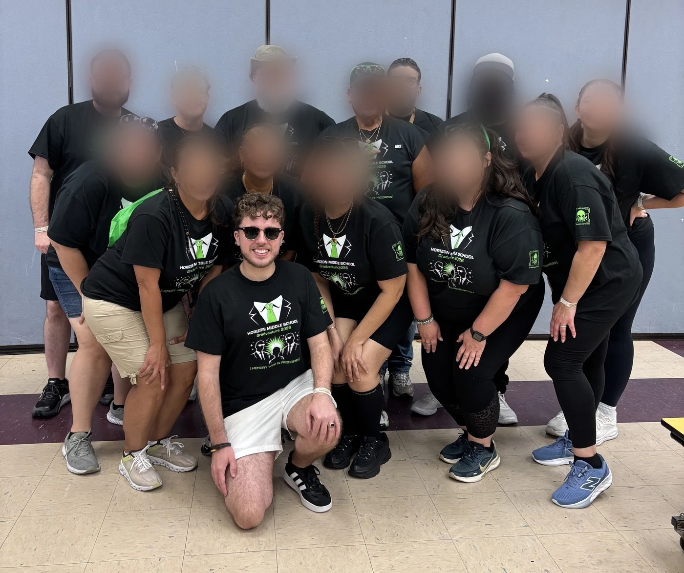
The approved agent-themed artwork carried through the vendor handoff and final shirt production. We received and sorted the completed shirts into student groups on April 29, ahead of the May 1 Gradventure trip.
What made this project meaningful was the handoff between creative decisions and operational details. The design could only succeed if the roster was accurate, the vendor received usable files and the print scope matched the budget decision.
What the work demonstrates
I enjoy the work that connects concept to execution: organizing information, weighing tradeoffs, responding to feedback and making sure the right version reaches the right person before production begins.
I took the lead on painting an 18-panel scenic production, directed volunteers when help was available, and managed the backstage flow when the show opened.
01 / Brief & ownership
The school production of Beauty and the Beast required three large scenic environments that could transition during the performance. The scenery was built around six rolling triangular prisms, each with three painted panels. A seventh prism at the front of the stage changed identity through its painted faces and removable elements.
My responsibility was the scenic painting. I drew guidelines, mixed the colors, completed most of the base work and intricate details, and painted nearly every set and costume element that required paint. I spent many sessions working independently. When students or staff volunteered, I directed simpler fill work within the outlines and color plans I had already established.
I balanced this production with my full-time visual arts teaching responsibilities, adjusting the painting sequence as available time, materials and volunteer help changed.
02 / Scenic concept development
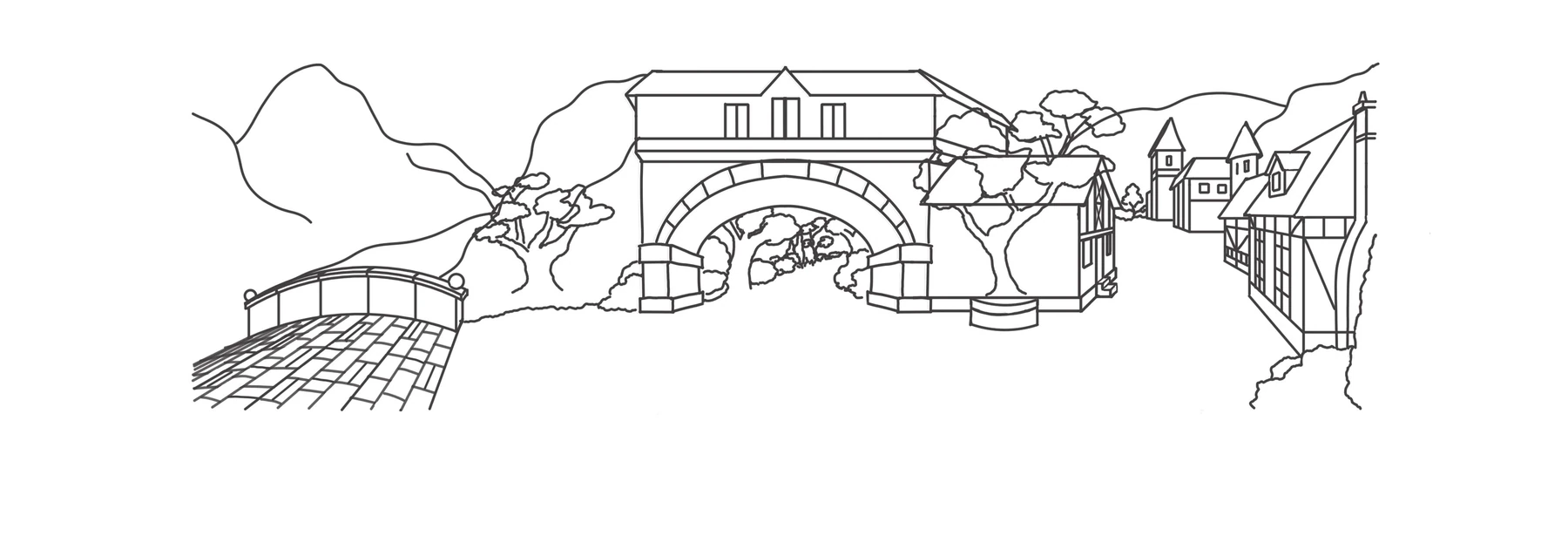
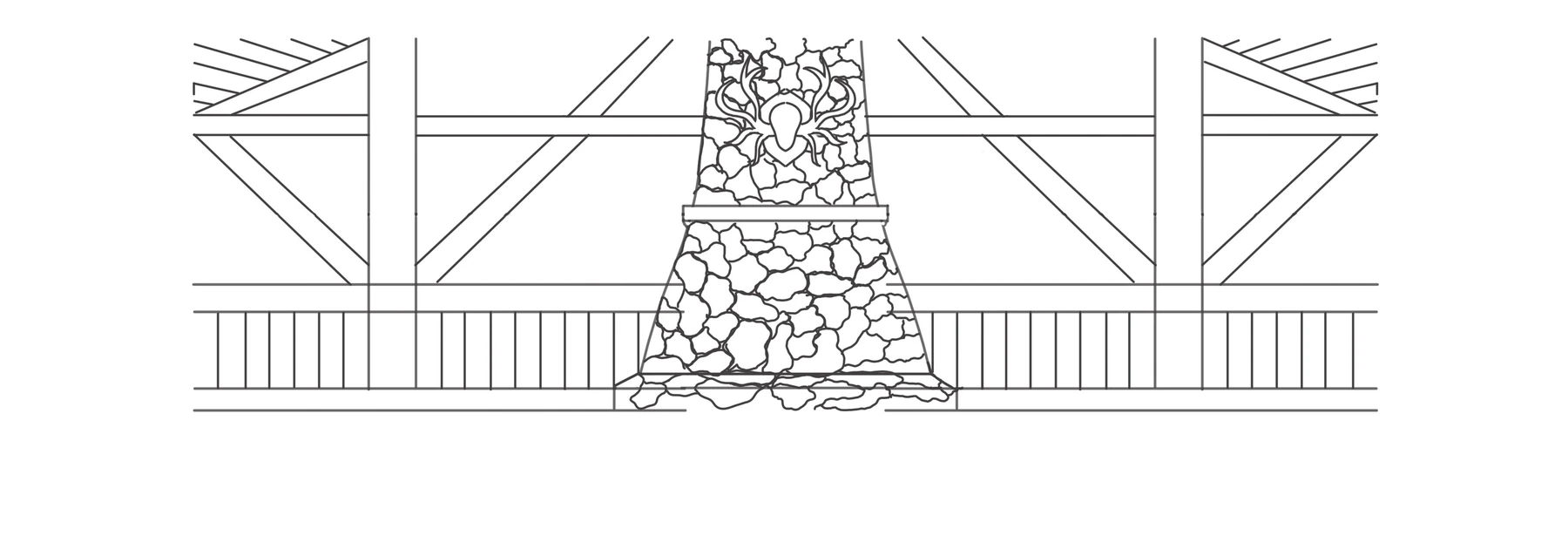
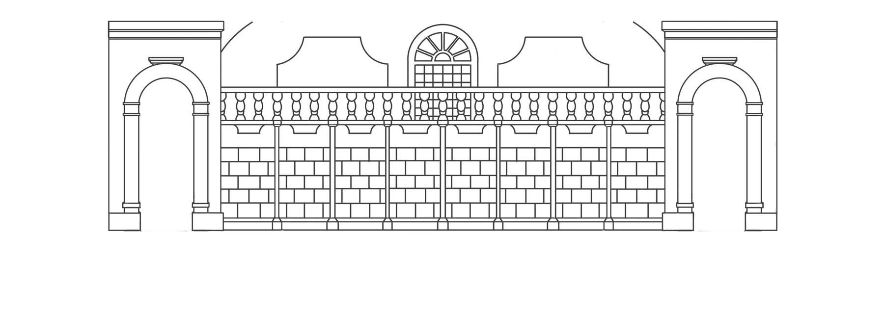
I began with sketches for the village, Gaston's tavern and castle. The designs had to function as individual settings while fitting the same rotating construction system.
How the transitions worked
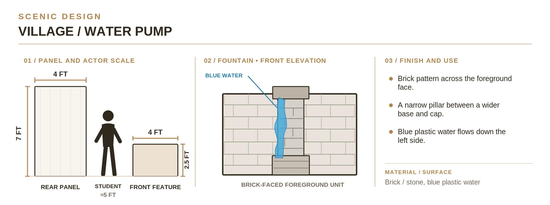
The audience saw a continuous backdrop formed by the flat sides of six wheeled prisms. Each three-sided unit rotated to reveal the next scene, while the foreground prism turned to show its matching feature. We measured and taped the stage floor to position the pieces.
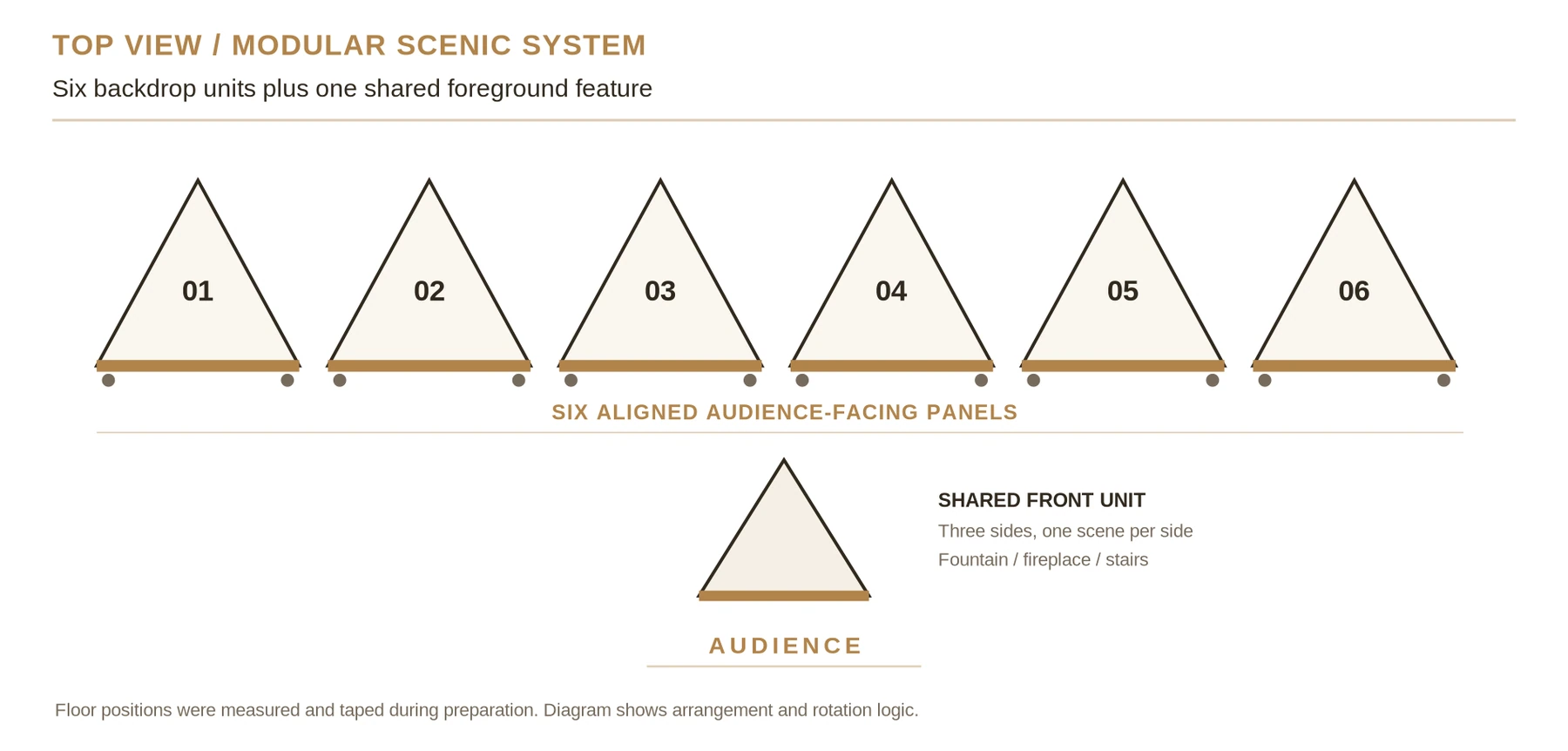
Click diagram to enlarge
Six independent rolling units created a continuous visual wall.
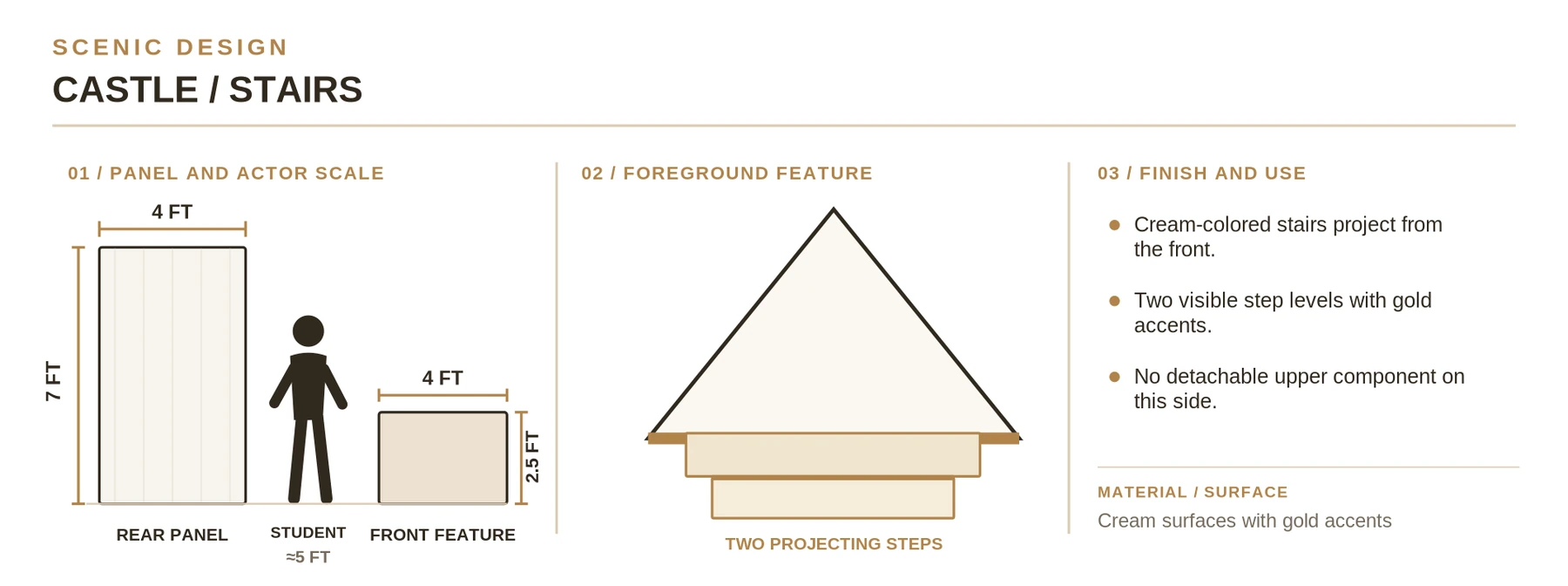
The shared center unit supplied the fountain, fireplace or stairs.
Turning the units revealed a different environment while preserving the layout.
03 / The making
The work overlapped rather than following one shared sequence. I started the village early and devoted the most detail to it, while the tavern and castle progressed at different times. I moved between pieces based on what was ready to paint and what the production needed next.
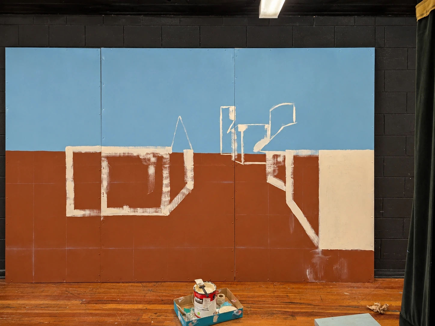
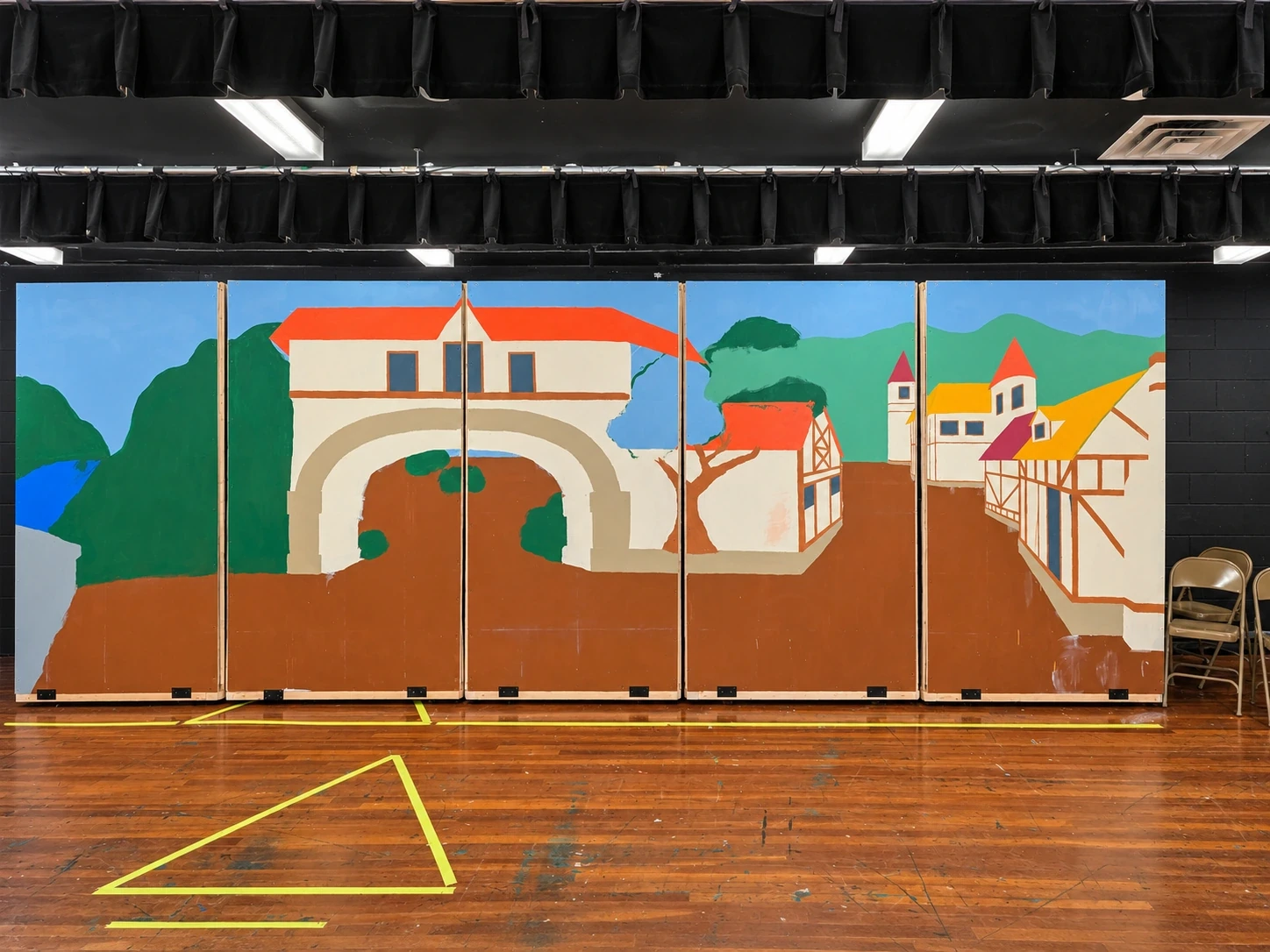
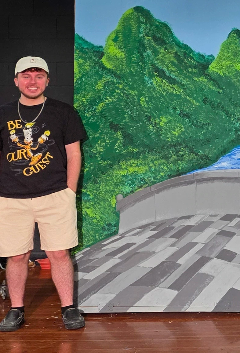
I began here first and kept returning to the detailed landscape, rooftops, stonework and distance effects. It was the last environment I completed.
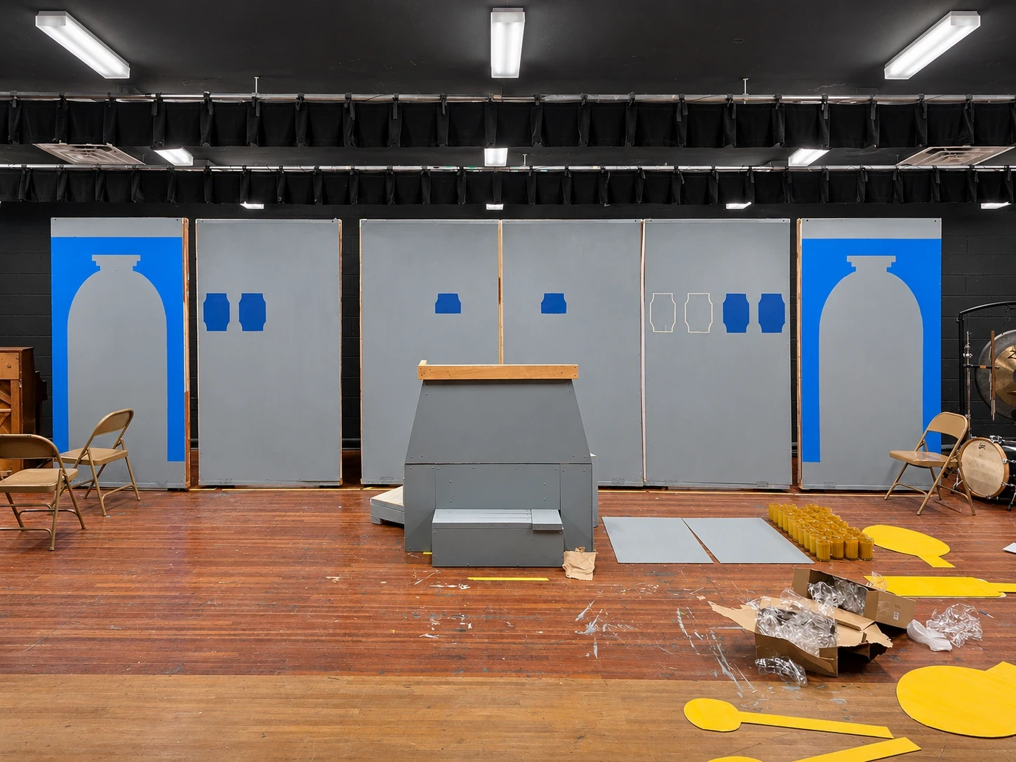
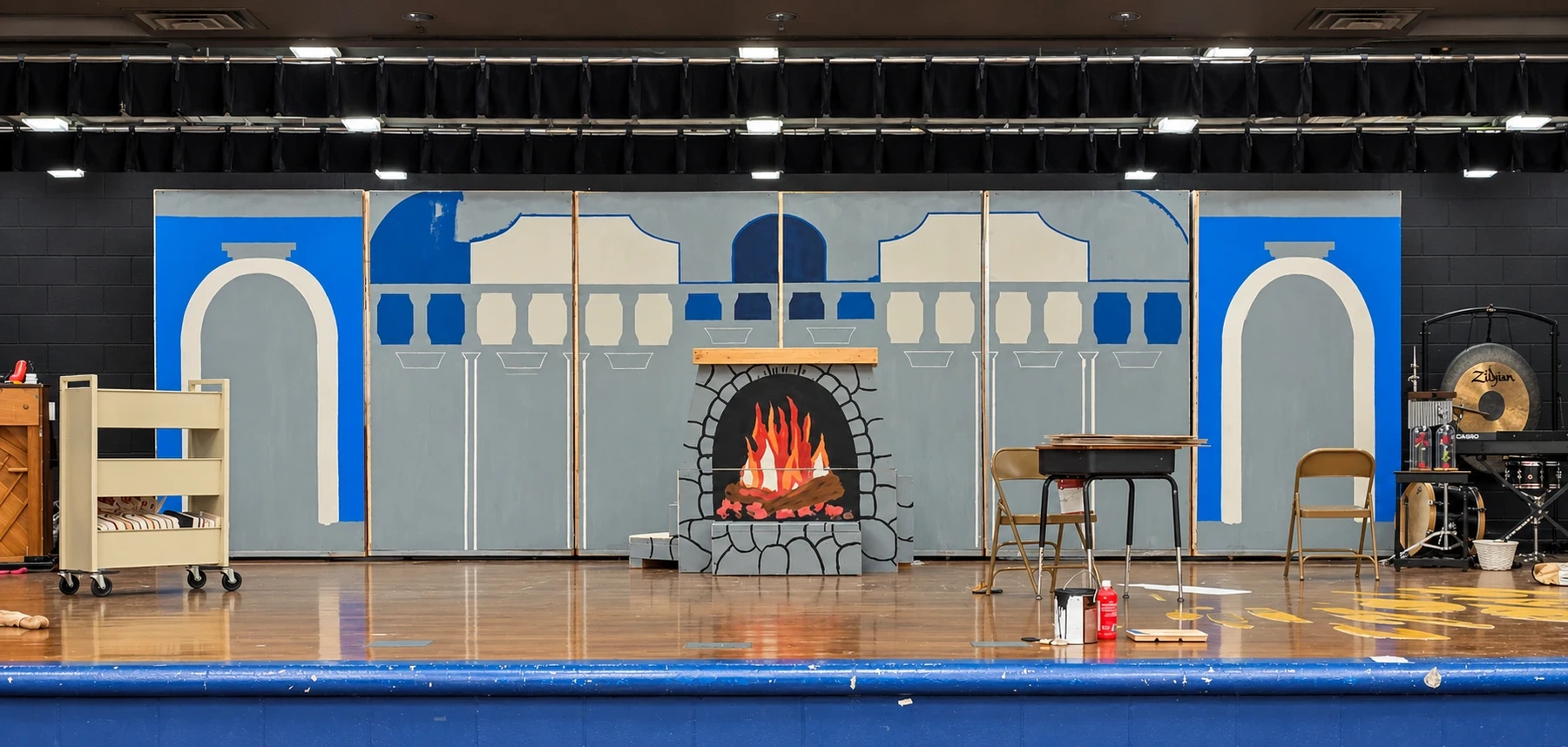
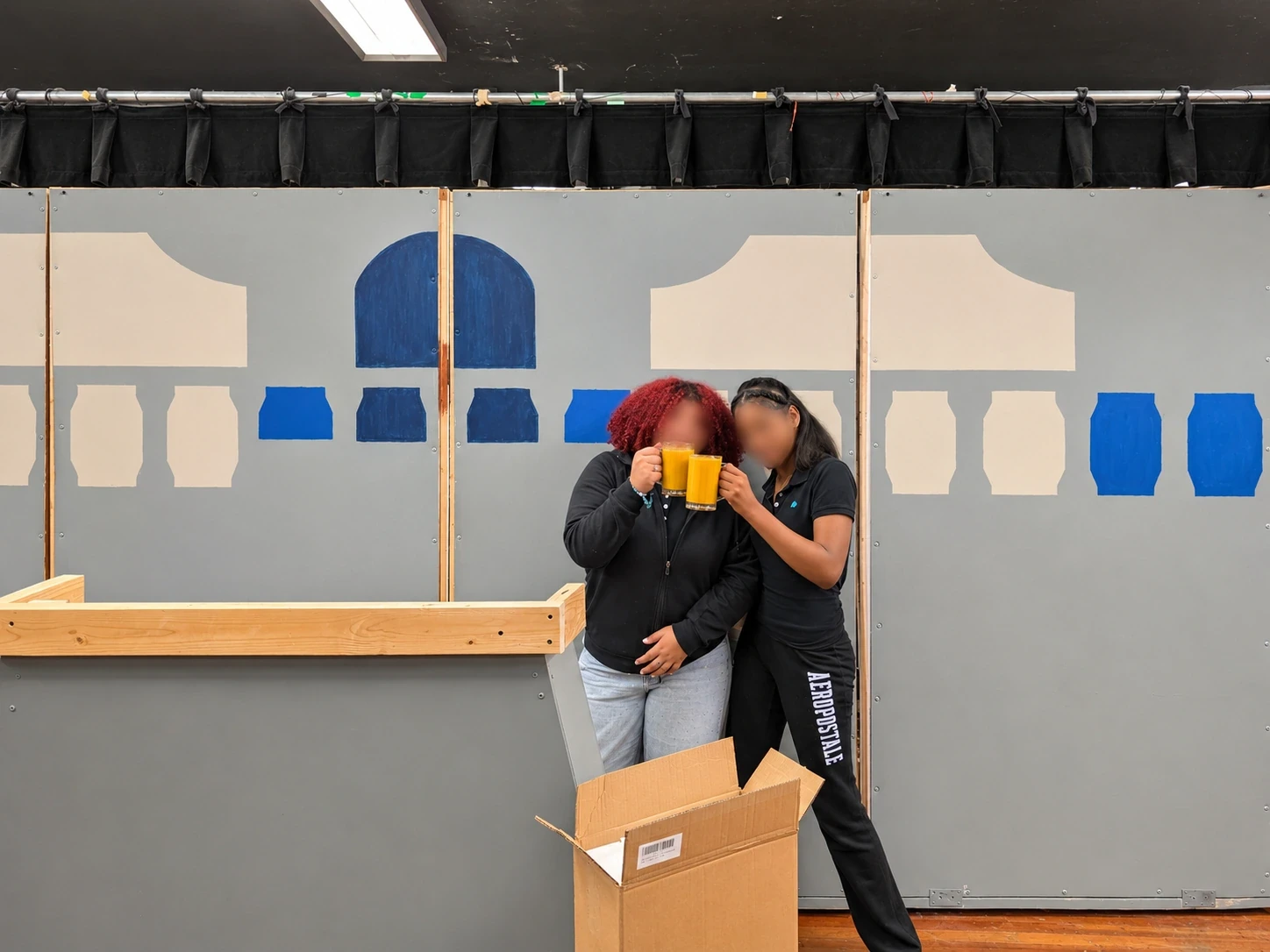
Cool blues, stone-gray fields and repeated arches needed to read as one architectural environment. The castle was finished after the tavern.
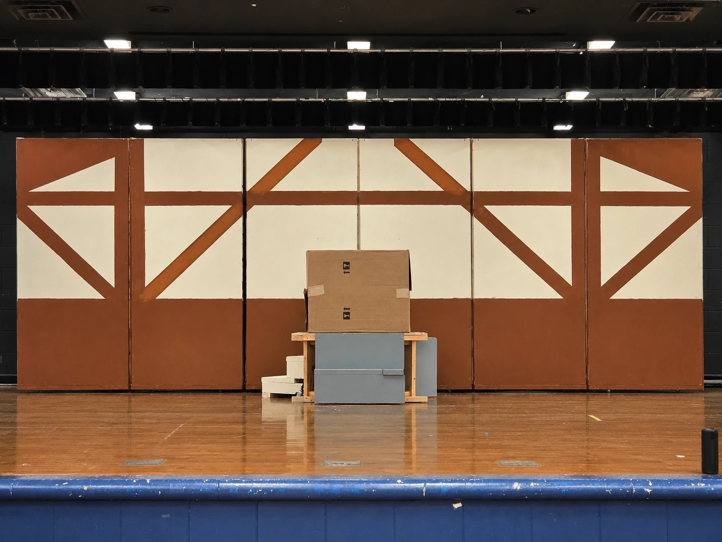
The timber structure and central hearth created a clear interior quickly. Of the three main scenes, the tavern was the fastest to complete.
Images show separate stages of work within each environment, rather than a single synchronized project timeline.
04 / Coordination in action
The surviving production messages show more than general updates. They document specific paint instructions, decisions about shared set pieces, and the work I delegated while keeping the detail painting and final appearance under my control.
I shared paint mixtures and guidance for grids, sky, timber and masonry. That gave occasional helpers a consistent reference without changing the visual direction.
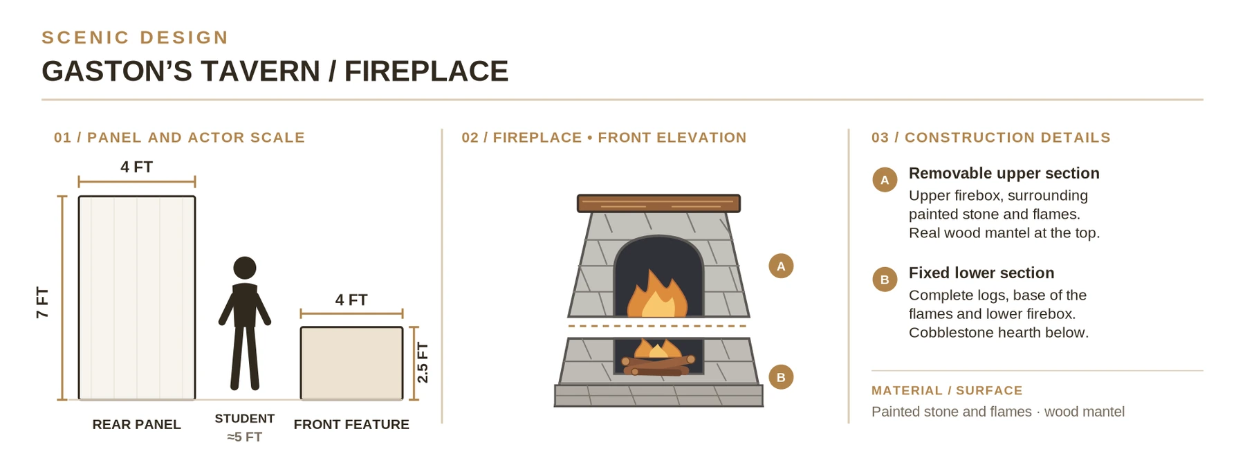
I identified areas a volunteer could fill, including fireplace outlines and background sections, before returning to architectural texture and corrections myself.
Messages addressed the fireplace structure, paint and primer options, and the distinctions between the village, tavern and castle faces of the shared foreground unit.
“The grid lines for each background can be the base color mixed with just a little black to make it darker.”
05 / Stage-ready environments
The finished scenic units transformed the same footprint into village, castle and tavern settings. I made the most of the available time to keep the large shapes readable from the audience and preserve detail where it mattered.
A layered landscape, stone bridge, rooftops and central water-pump feature.
Symmetrical arches, cool stonework and cream stairs with gold accents.
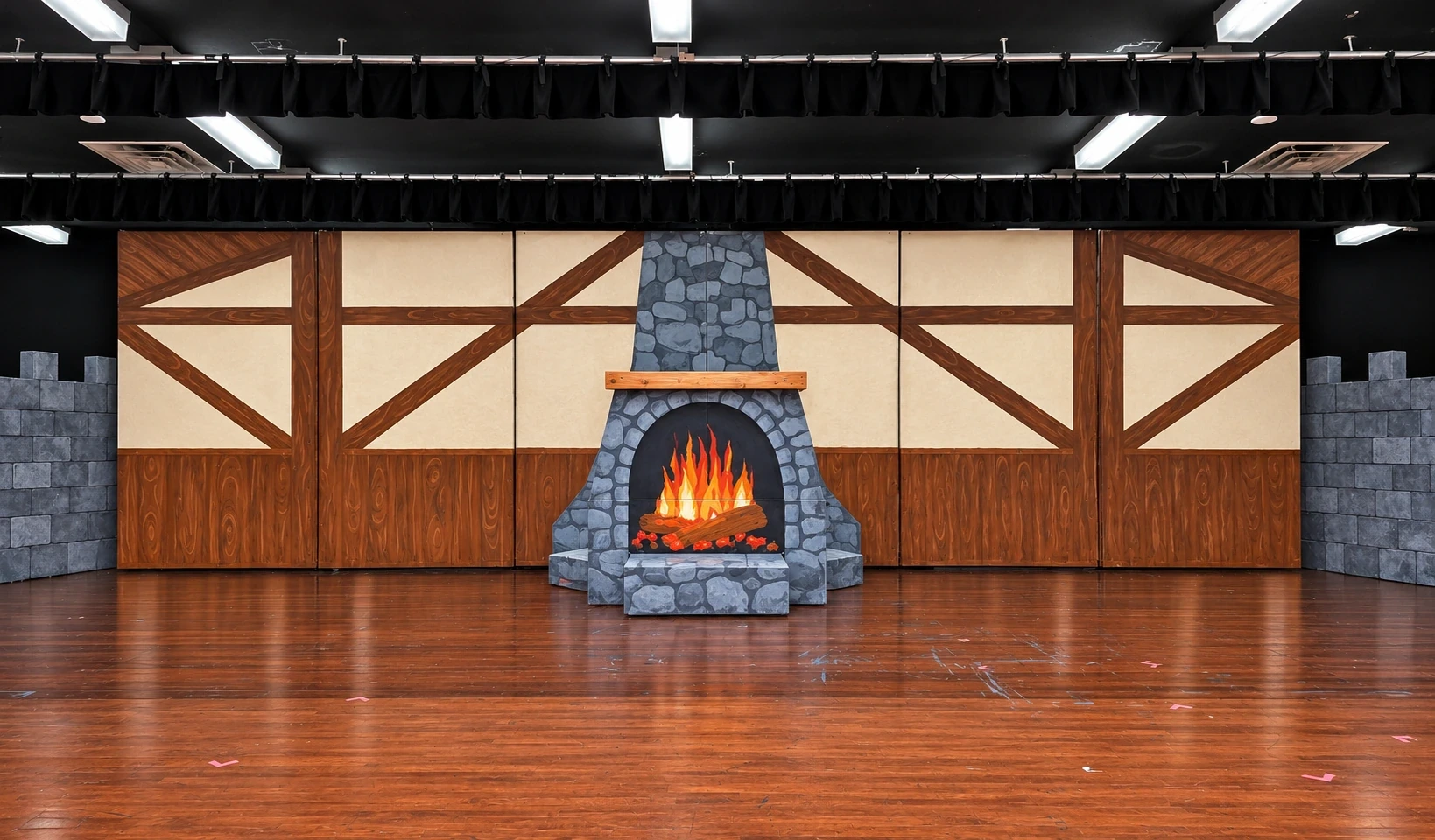
Timber framing, warm interior color and a stone fireplace with flame detail.
Photographs taken April 24, after the final performance.
06 / Production timeline
Village, tavern and castle drawings established the three environments.
I built village foundations while beginning additional elements when materials and access allowed.
Village detail continued as the tavern and castle advanced through separate stages of blocking, texture and finishing.
The scenery was placed on stage and adjusted for the performance space.
I directed backstage actor movement, scenic transitions and prop changes while the theatre teacher played music.
The three finished settings were documented after the last show.
07 / Outcome & reflection
I helped turn 18 individual painted faces into three recognizable theatrical environments and then supported their use in two live performances.
The project combined creative ownership with a different kind of responsibility at showtime: helping a large student production move between scenes safely and coherently.
Lessons carried forward
The painting required patience and judgment. The coordination required clear standards, flexible priorities and practical direction. The performances demanded quick decisions in real time. Together, they are why I enjoy taking a complex creative idea all the way through delivery.
I organized a large-scale piñata project for nearly 190 art students, rallied donated materials, and curated the finished work into a public Hispanic Heritage exhibition.
01 / The brief and ownership
For Hispanic Heritage Month, I designed a hands-on project in which students researched cultural inspiration, planned their own sculptures, built papier-mâché forms and finished piñatas for a school community exhibition.
The opportunity was exciting, but the constraints were substantial. Nearly 190 students needed supplies, structured steps, drying time and guidance, without a dedicated classroom budget for the undertaking.
I owned the instructional design, public donation request, materials planning, daily troubleshooting and exhibition presentation. The goal was to make an ambitious creative experience accessible to students with different design ambitions and construction abilities.
02 / Original classroom introduction
The actual presentation used to launch the project connected Hispanic Heritage Month to the history of the piñata, then turned that context into clear design choices. Students were asked to research a specific culture, develop a buildable form, and use color and pattern intentionally.
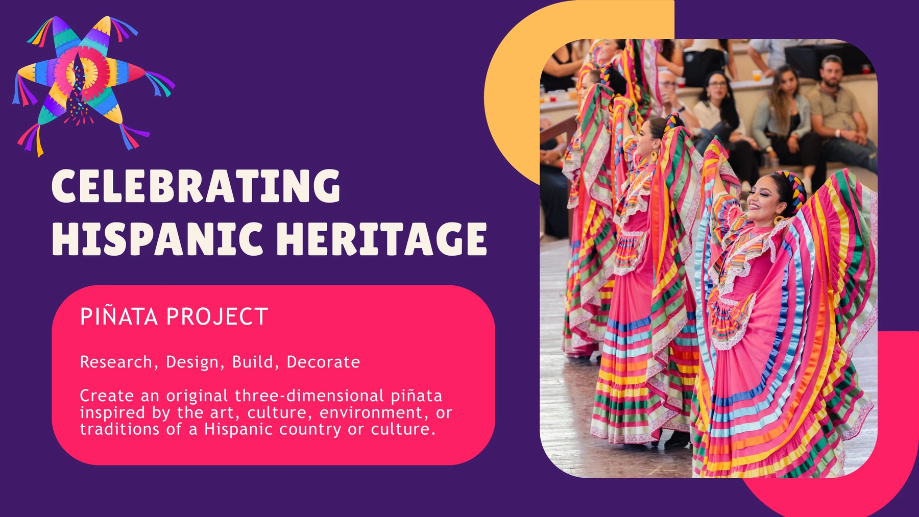
Understand the tradition. Students explored what a piñata is, its connection to Mexican culture, and how the tradition has evolved.
Research rather than stereotype. Four paths for inspiration, nature, food and objects, art and patterns, architecture and places, kept the work rooted in particular cultures.
Design with constraints. Students learned how simple three-dimensional forms, construction strength, and color choices could translate research into finished sculpture.
For each class period, I randomly generated the order in which students chose their research country. I capped duplicate selections, distributing choices across the available countries so a few familiar options would not dominate the exhibition.
This preserved student agency while creating more even cultural representation across the finished work. It also established clear expectations from the outset, before independent research and design began.
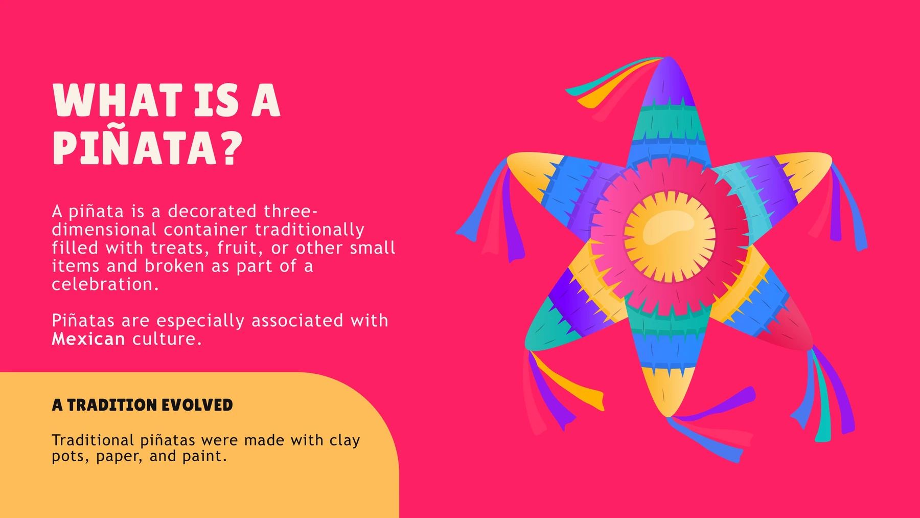
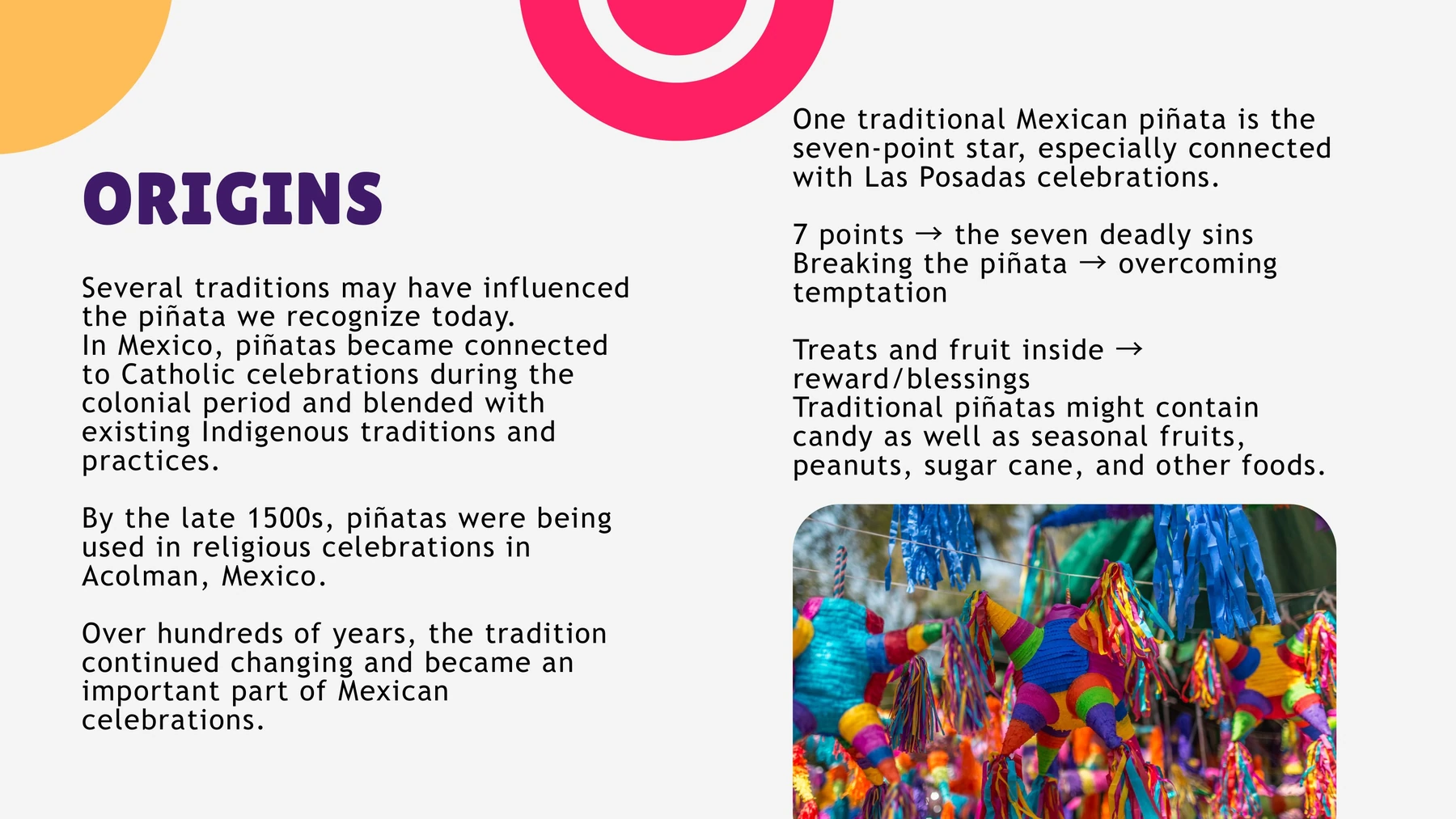
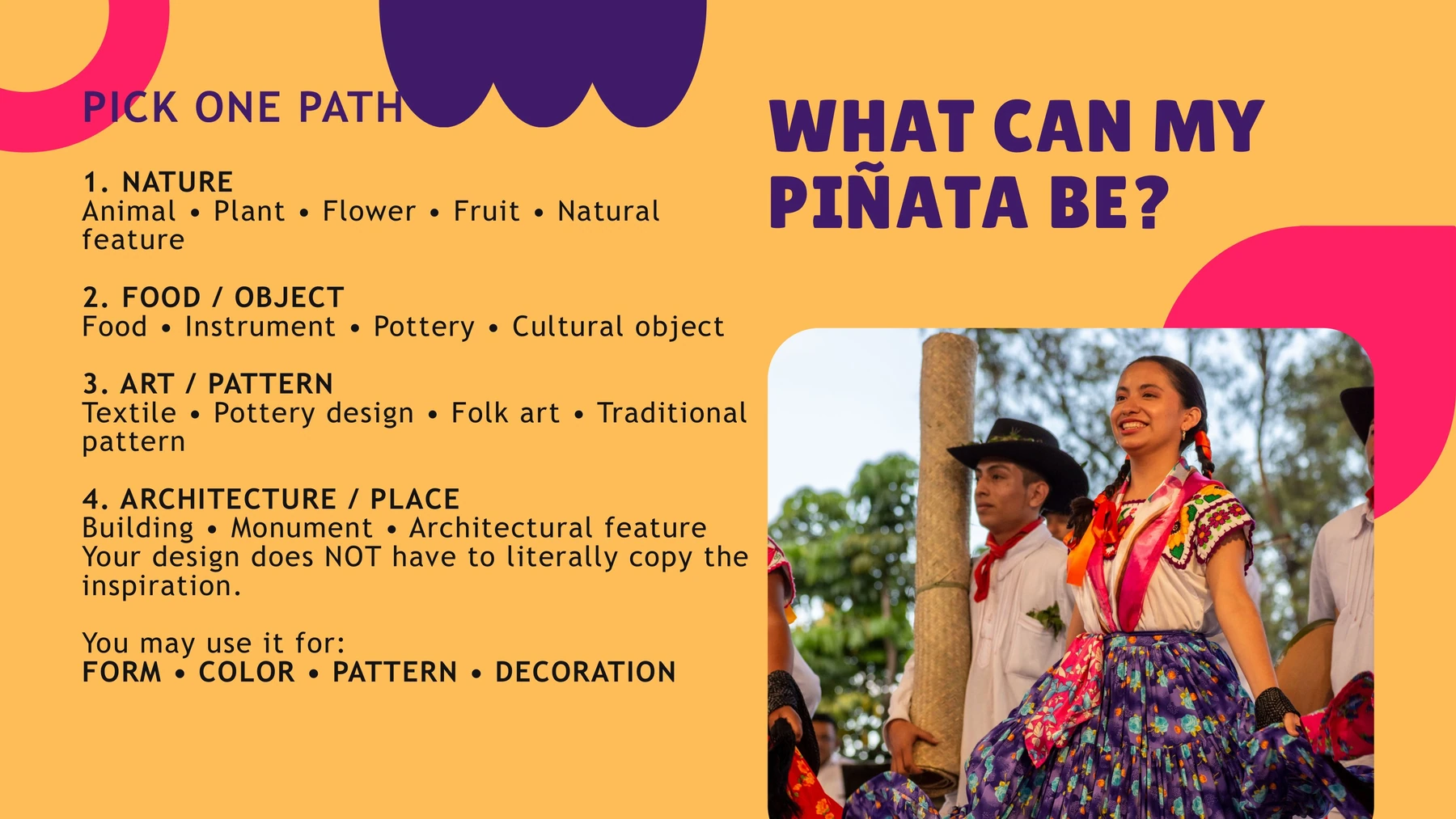
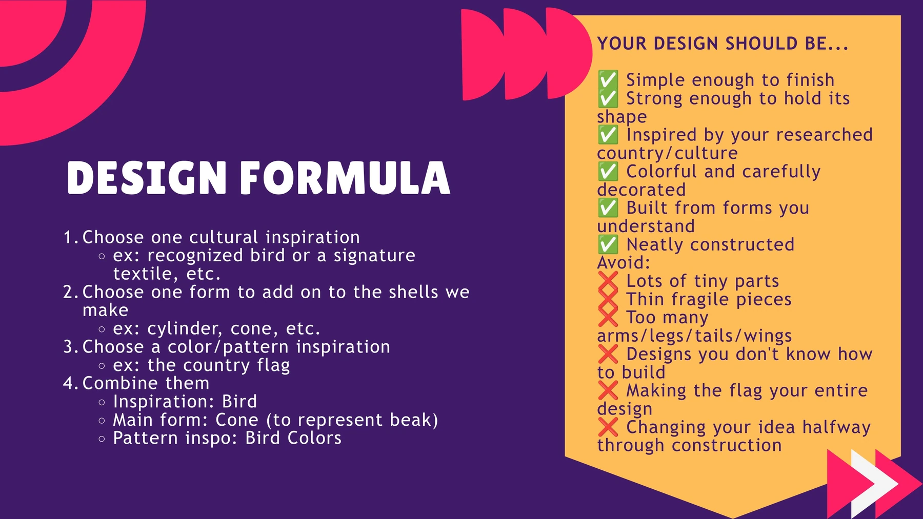
Source: the original 14-page classroom introduction, Culture, History, and Traditions. Slides featuring student names and class assignments are intentionally omitted.
03 / Community outreach and supply planning
With no dedicated project budget and nearly 190 students working on individual sculptures, I forecast materials, requested donations from families and staff, and followed up with a quantified progress update.
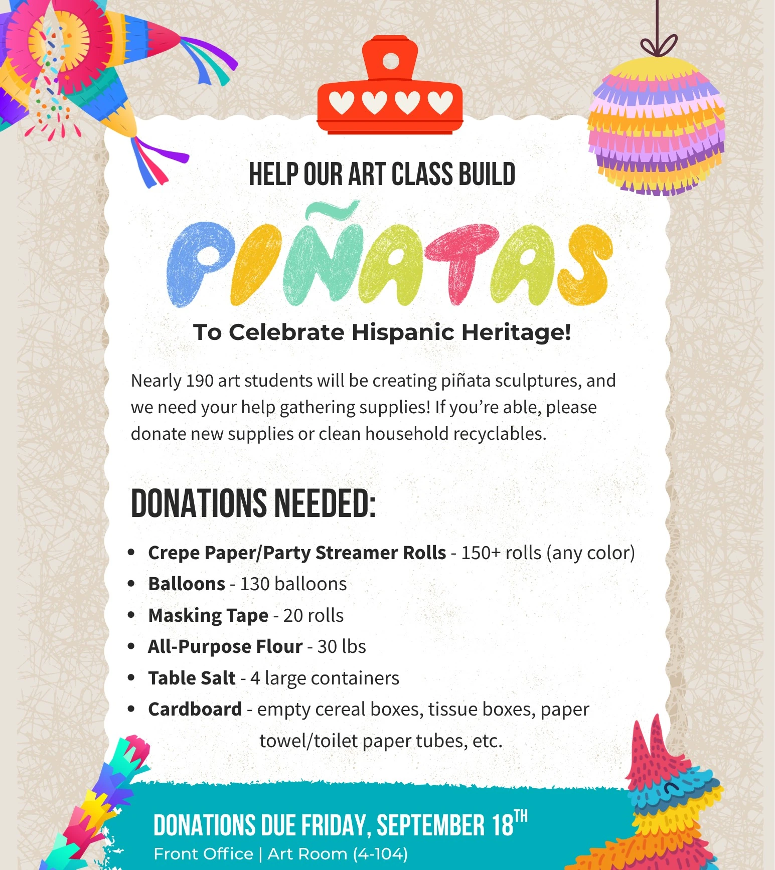
Rather than making a general appeal, I shared the exact types of donated materials that would keep construction moving: paper streamers, balloons, masking tape, flour, salt, and household cardboard.
The follow-up distinguished what was still needed from the overall goal; these figures are request quantities, not confirmed donated totals.
After the initial donation drive, I shared an itemized update showing which materials were still needed, so families could contribute where it would make the greatest difference.
04 / Student scaffold & production system
My student project roadmap turned the cultural introduction into a repeatable process: research, two sketches, a viable design choice, approval, construction, decoration, and reflection. It provided independence without sacrificing shared checkpoints.
Explore nature, craft, food, music and architecture connected to a specific culture.
Sketch two ideas; identify shapes, color and cultural sources.
Choose a construction level, obtain approval, and work through paper layers and drying.
Refine the surface, complete the work and explain its connection to the research.
Students used a shared sequence of research, design, approval, construction, and reflection, with planning choices scaled to their individual projects.
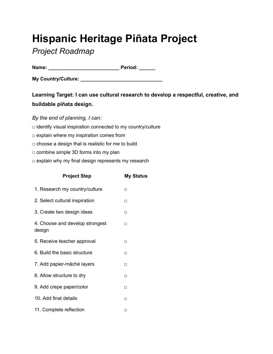
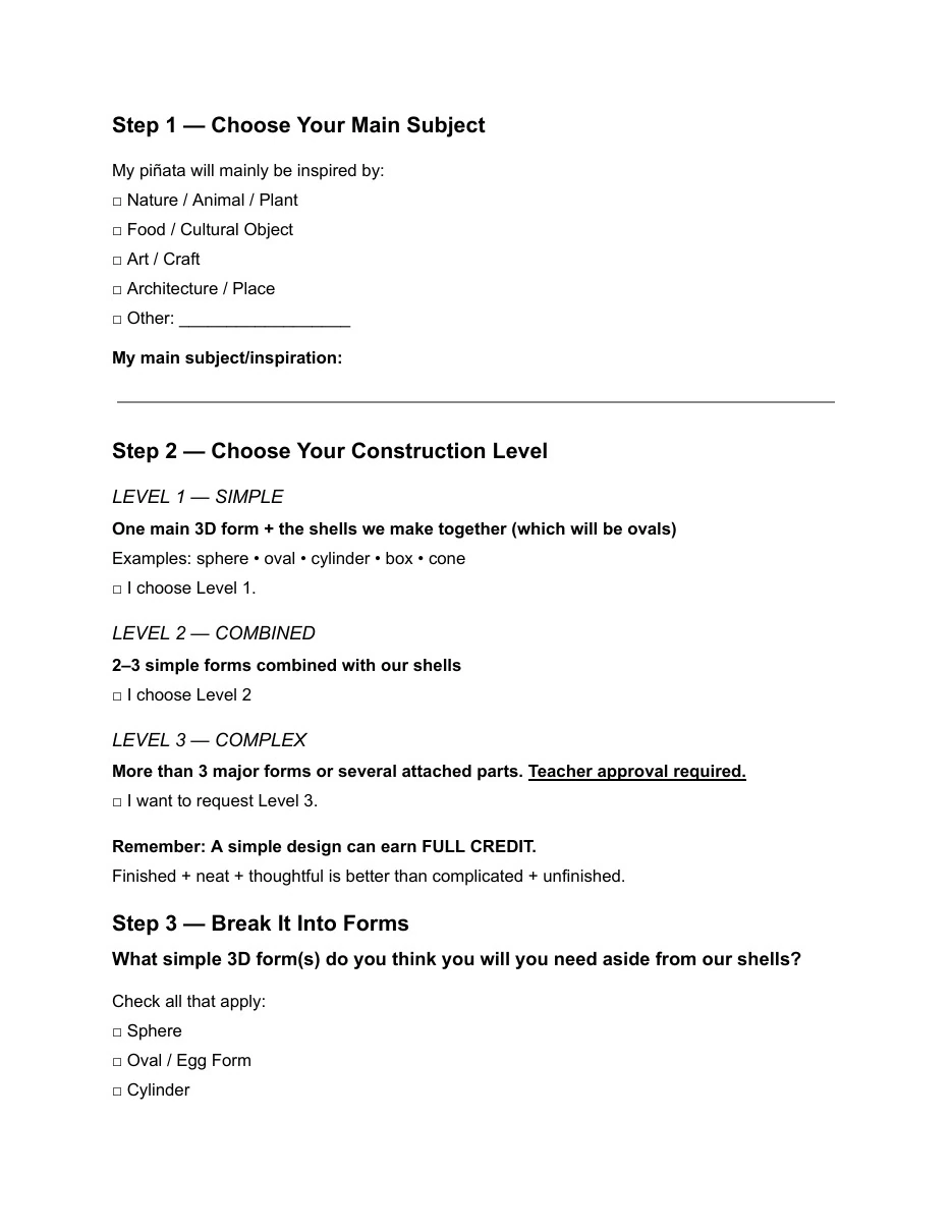
Accessibility through clear instructions
I supported the workflow with visual examples, demonstrations, and instructional materials in English, Spanish, and Portuguese. Students could work at different construction levels while meeting the same research and design expectations.
05 / Production and problem solving
With nearly 190 individual piñatas underway, material consumption exceeded my initial estimates. As supplies ran out, I adjusted our construction methods and taught students new techniques so work could continue.
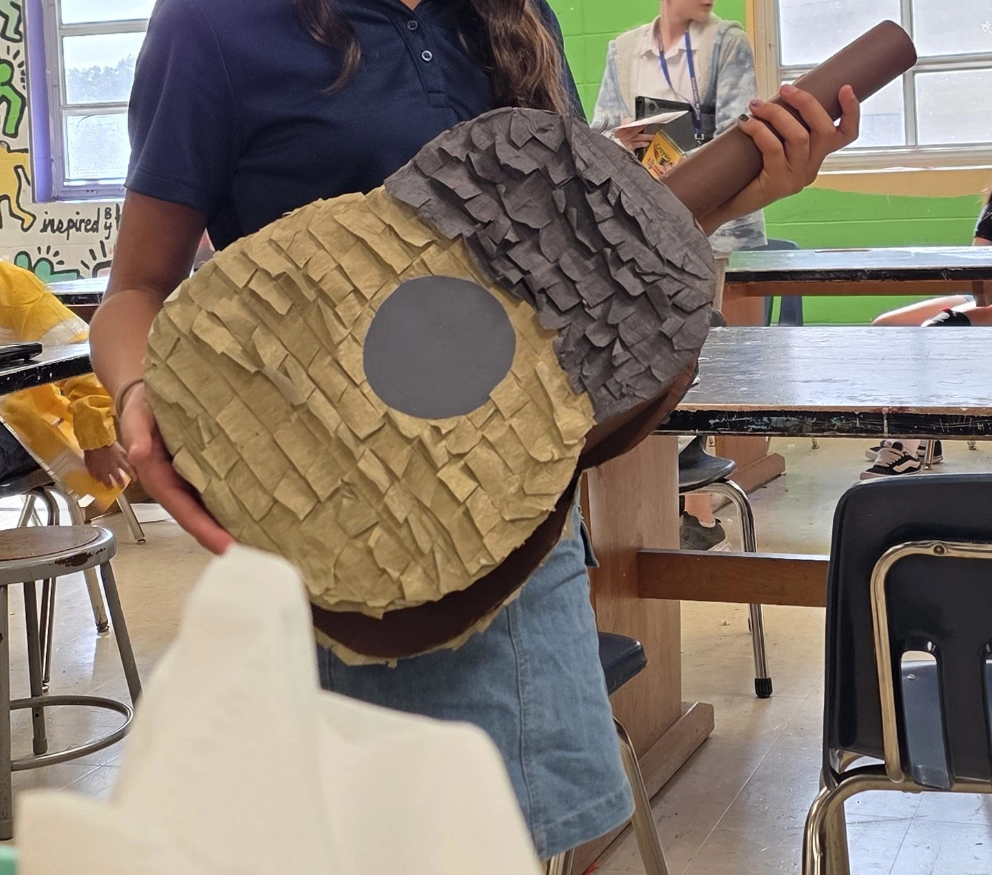
When the donated flour for papier-mâché paste ran out, I switched to the classroom’s existing glue reserves to keep students working on their structures.
When we exhausted our premade shapes, I showed students how to cut cardboard and assemble their own forms to fit their individual piñata designs.
When masking tape ran out, I brought out the classroom hot-glue guns. Before students could use them, I led a safety lesson covering their proper handling.
06 / Exhibition installation
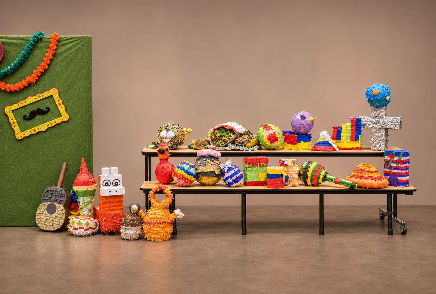
For the school festival, I arranged student work into a coordinated display using tables, risers and scenic elements. The installation needed to be readable from across the gym while allowing visitors to move around the exhibit and appreciate the individual sculptures.
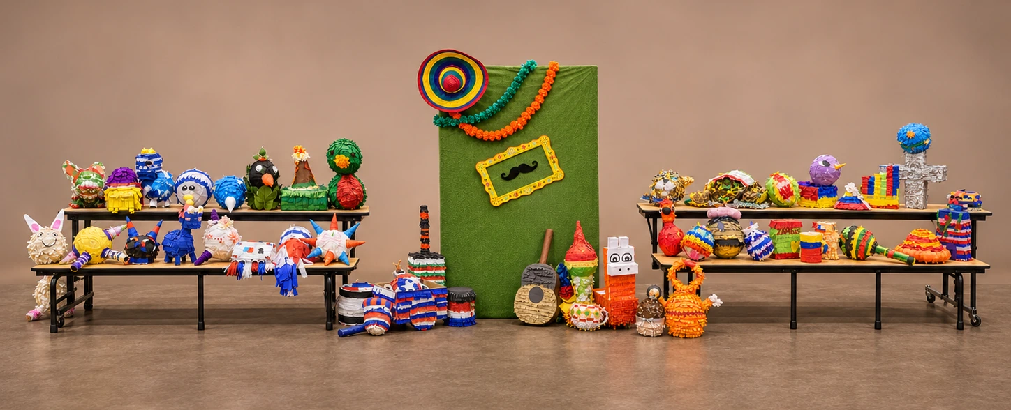
From intricate small forms to large sculptural constructions, the student work reflected a wide range of ideas and building approaches. The variety became a strength of the final exhibition.
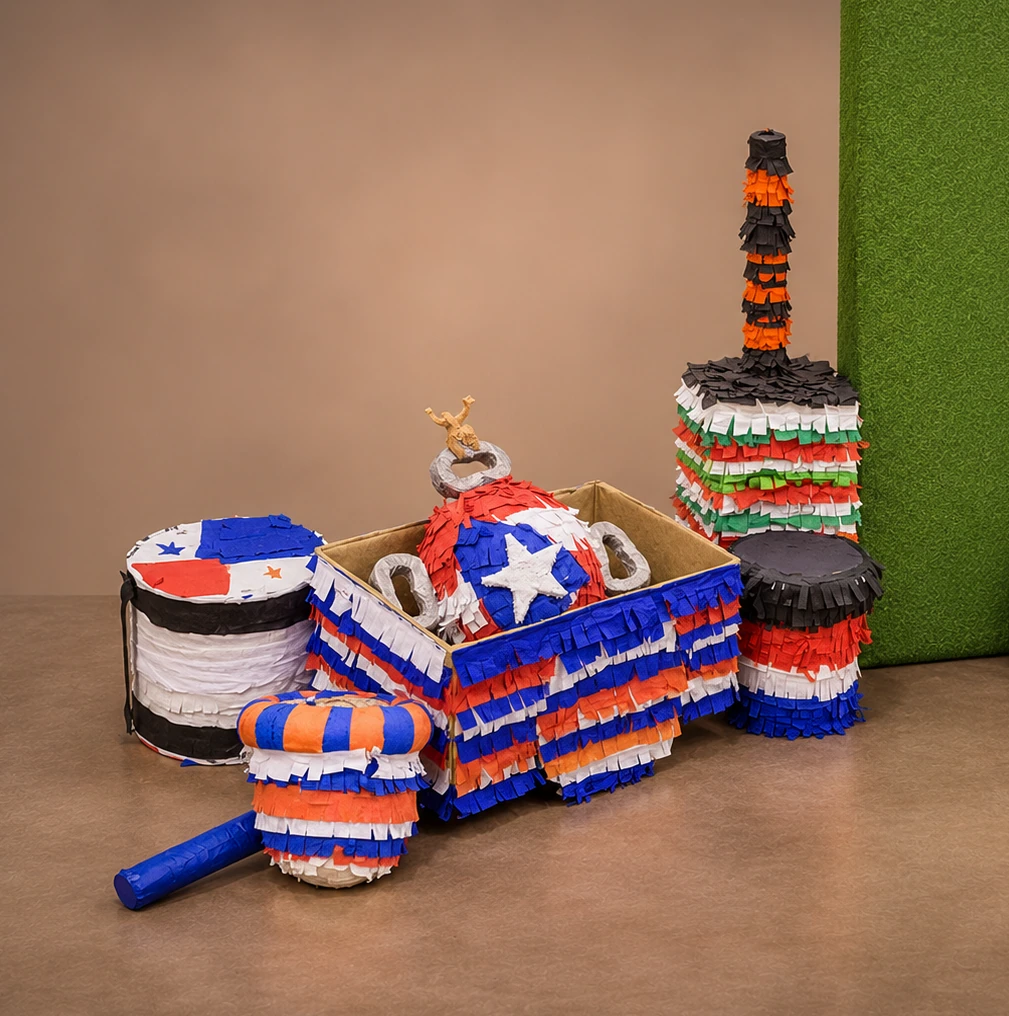
Large piñatas, colorful forms and the tall backdrop established focal points.
Tables and risers supported pieces with different proportions and stability needs.
The presentation emphasized the variety of student designs rather than a uniform template.
07 / Project timeline
The project developed through family engagement, resource planning, student research, hands-on production, and a public celebration of the finished work.
Met with families, introduced upcoming art projects, and discussed opportunities to donate materials.
Began collecting supplies in earnest and sent families a progress update with remaining material needs.
Created the donation flyer; the principal shared it with students, families, and teachers across the school network.
Students began researching their selected countries and planning culturally inspired, buildable piñata designs.
Students moved from their designs into building and decorating their piñata sculptures.
Presented the finished student sculptures at the Hispanic Heritage community event.
08 / Outcome and reflection
The completed exhibition brought student cultural research, hands-on construction and community-donated materials into one schoolwide presentation. The variety of sculptures made the display feel expressive and personal.
Families voted the display their favorite at the festival, a meaningful response to the work invested by the students and everyone who supported the material drive.
What this work demonstrates
Coordinating this project meant translating a creative goal into workable steps, communicating supply needs, adapting to delays and making the final display feel cohesive. That combination of creativity and practical planning is the kind of work I want to continue doing.
When COVID-19 changed campus life, I helped bring residents together online, building a shared Discord community across four UCF Housing buildings and creating recurring reasons to connect.
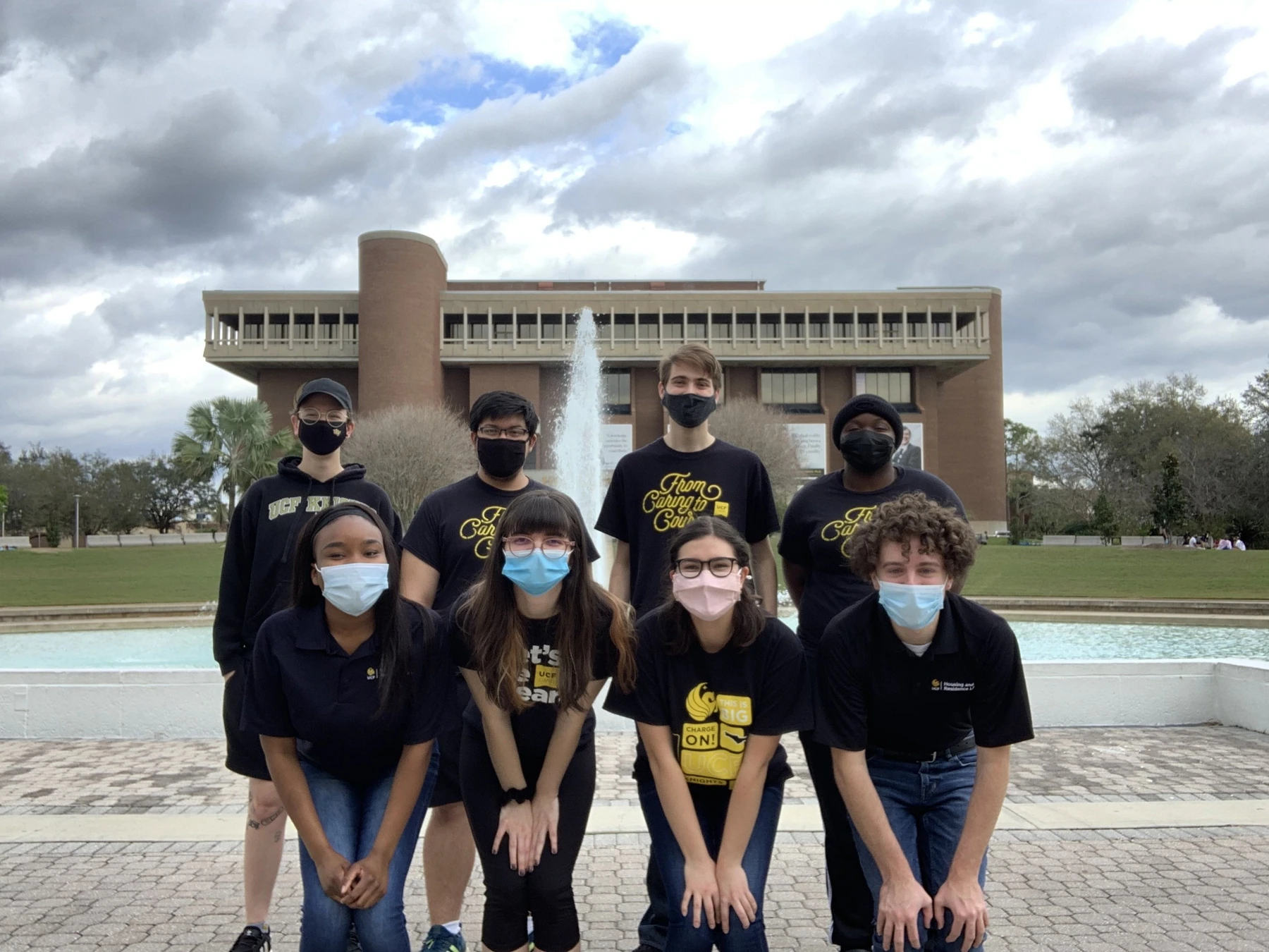
01 / The challenge and the opportunity
My first semester as a Resident Assistant coincided with COVID-era restrictions and remote learning. The usual ways residents got to know one another, shared spaces, spontaneous conversations, and in-person gatherings, were far less accessible.
I saw an opportunity beyond the residents directly assigned to me. Four neighboring housing buildings could benefit from a shared space that made it easier to find activities, start conversations, and feel part of a larger campus community.
During the initial COVID-era restrictions, even our floor meetings moved online to Zoom. When in-person activities resumed, our team chose to keep the Discord community as a permanent part of resident communication.
02 / The digital approach
I built an Apollo Community Discord server with shared spaces for introductions, rules, events, and conversation, then organized dedicated channels by residence hall and floor. That let residents participate in a wider community without losing the relevance of their own building.
The structure supported everyday announcements and event promotion while giving residents a clear route to peers and RAs. Staff-only channels and moderation settings helped separate internal coordination from resident-facing communication.
A single, easy-to-navigate communication system supported four buildings and recurring digital programming.
Original work / Making the community visible
When the initiative began, floor meetings were held virtually over Zoom. This Polk Hall flyer came later, after in-person lounge meetings resumed. It shows how the Discord community continued beyond its original COVID-era purpose: residents were still encouraged to join the server before attending and could message their RA there if they could not make it.
Resident outreach
The flyer paired a return to in-person meetings with an established digital communication channel. Discord remained a way to get updates and contact an RA, including for residents unable to attend in person.
Online community care
An archived moderation screen records verified-email access and content filtering for all members. Those settings helped establish expectations for a shared space residents could use.
Discord server moderation settings
03 / From launch to routine
I approached programming as an ongoing cycle of invitation, clear instructions, shared experience, and follow-up communication.
Look for activities that could work even when gathering in person was difficult.
Bring communications into a four-building Discord space instead of relying on isolated outreach.
Use original digital graphics, curated recommendations, and watch-party guidance to make joining easier.
Host recurring events and refresh announcements so residents had reasons to return.
04 / Virtual programming
The program combined self-paced film discovery with live virtual events. Curated movie lists gave residents easy conversation starters; recurring watch parties and creative sessions offered ways to spend time together remotely.
Curated resources
I designed a film recommendation guide organized by streaming platform and genre, giving residents several ways to find a movie worth sharing or discussing.
Recurring live events
I shared practical instructions for joining virtual watch parties and hosted weekly sessions to recreate a familiar group experience online.
Creative participation
A virtual creative meet-up invited residents to design Zoom backgrounds in Canva or make pixel art, with time built in to meet others on campus.
Original work / Film recommendations
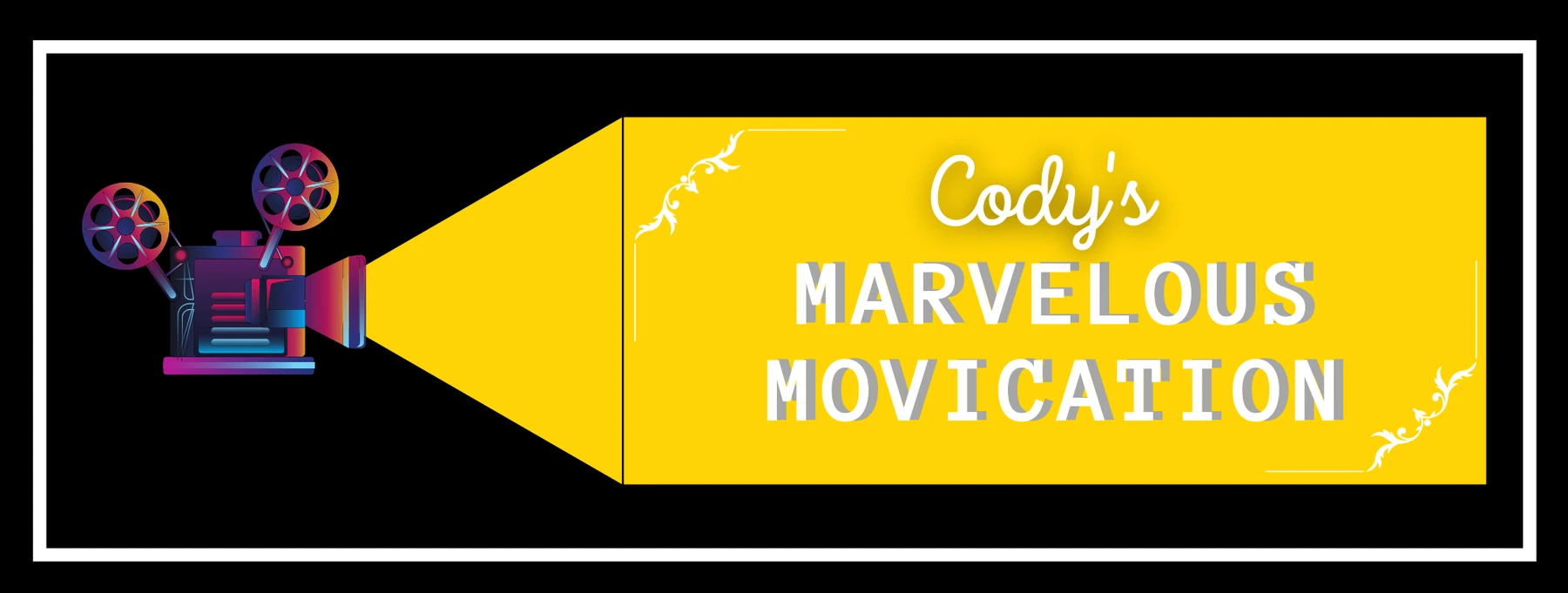
“Movication” combines “movie” and “education,” a playful nod to the film-education exchange in Pitch Perfect. The name made a curated watchlist feel more inviting and social.
Instead of simply telling residents to watch a movie, I organized recommendations by the services they might already have and by the kind of film they wanted to see. The filmstrip format made a dense list feel like an entertainment guide.
The movie lists reflect the titles and streaming services available when this resource was created.
Original work / Virtual event promotion
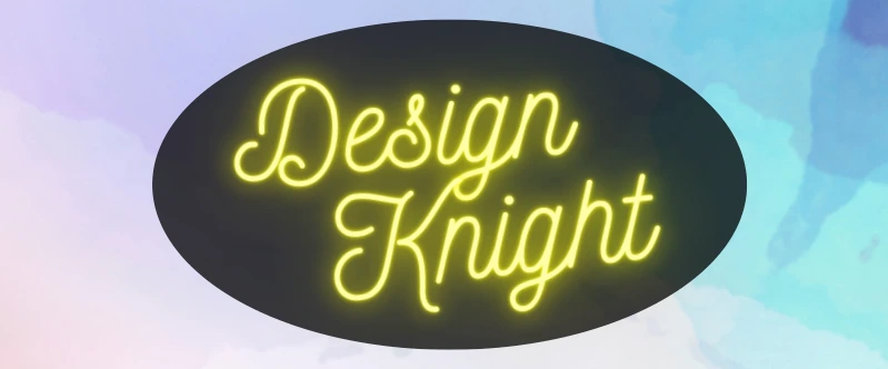
Design Knight offered another way to participate beyond movie watching. Residents were invited to create personal Zoom backgrounds in Canva or pixel drawings and meet other students while working.
The approachable activity gave people something to do together, reducing the pressure of joining a conversation with strangers.
05 / Communication & promotion
Even the strongest programming needed clear invitations. I used original graphics, event announcements, and physical floor displays so residents knew what was happening and how to take part.
Film recommendations and themed welcome materials gave my communications a recognizable, approachable voice. The Discord space extended that outreach beyond the physical hallways.
Visual concepts for floor branding, movie recommendations, and event promotion.
Step-by-step guidance that made virtual watch parties easier to understand.
Reinforcement through residence-hall displays, program announcements, and Discord communication.
Related work / Residence-hall communication
The digital community was one part of my wider RA outreach. I also designed materials that introduced me to residents, shared interests in an approachable way, and made ordinary residence-hall information more inviting.
06 / Collaboration
A stronger community came from making it easier for people to show up for one another.
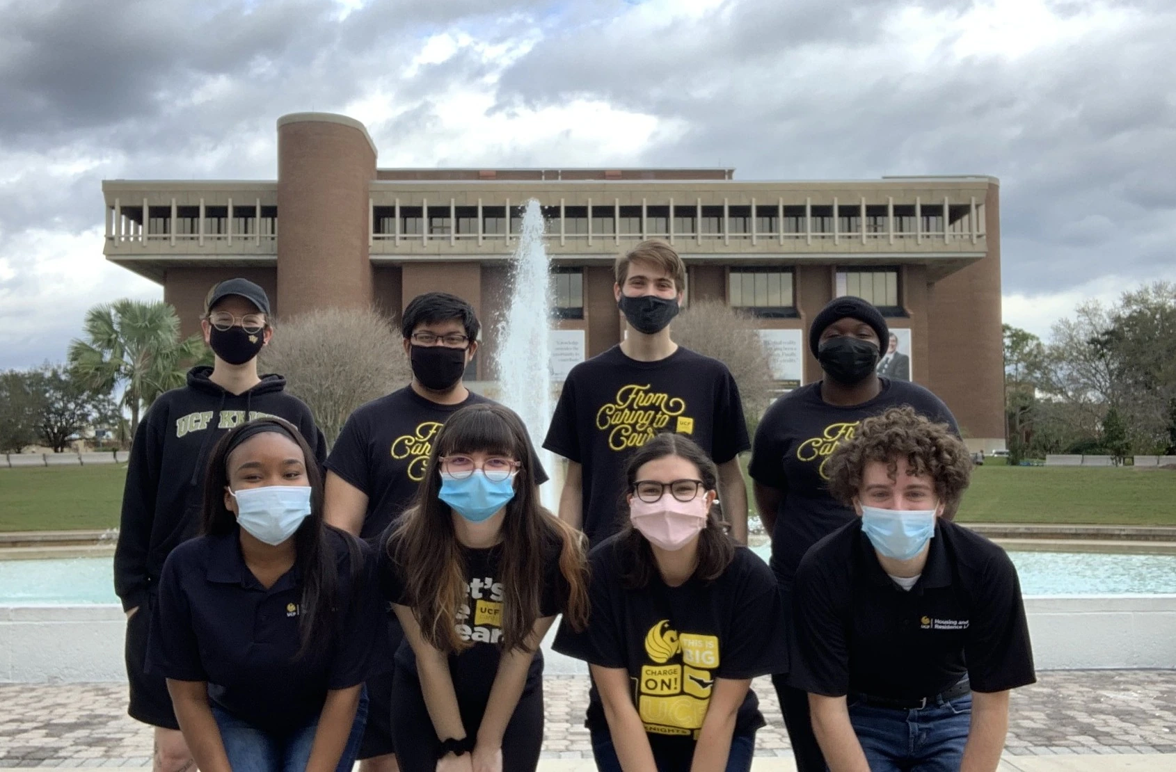
Although I initiated and developed the four-building digital community, the work happened within a wider UCF Housing team. Fellow Resident Assistants were part of the effort to keep residents connected during an unusually isolating period.
Those colleagues helped sustain a culture of resident support and connection. Their contributions helped the effort reach beyond any one RA’s assigned floor.
My role: Independent initiative, community communications, program development, promotional design, and recurring virtual events. Team context: COVID-era UCF Housing resident support and engagement.
07 / Outcomes and recognition
The goal was not simply to start a server or schedule an activity. It was to make residents feel noticed, invited, and connected during a period when face-to-face contact was limited.
During my first semester, I was recognized for the highest level of resident outreach and personal connections across two large UCF Housing communities, among approximately 30 Resident Assistants.
That recognition reflected my broader engagement work, including the consistency and initiative I brought to this digital community effort.
The experience taught me how small, repeatable systems, a shared hub, clear communication, and predictable opportunities to participate, can help people feel part of something larger, even when they cannot be together physically.
A proposal to transform a former golf-course site into a community arts destination, developed for a real client through collaborative research, preliminary budgeting, and original architectural visualization.
01 / The brief
RoseArts District was an active redevelopment concept for a former golf-course property in Orlando. Our five-person student team was among the groups developing ideas for a client considering alternative proposals.
We proposed a destination where artists could make, teach, exhibit and sell their work, supported by adaptable spaces for events and public activity. Our proposal was considered but ultimately not selected.
The process still required us to translate an ambitious idea into researched uses, spatial concepts, preliminary estimates and tangible presentation materials.
02 / Proposed experience
Rather than relying on a single attraction, the team envisioned a connected set of spaces that could support different audiences and forms of creative activity.
A welcoming venue for rotating exhibitions, small artworks and informal gathering.
Flexible instruction space for workshops, camps and community arts programs.
Reused freight containers and existing structures to plan modular studios and temporary retail space, balancing creative flexibility with material efficiency.
Outdoor art experiences to create landmarks and encourage exploration.
Gardens and pathways designed to add gathering space and creative inspiration.
Exhibitions, classes, and temporary events intended to keep the site active.
The visitor journey
The original concept arranged galleries, studios, classrooms and outdoor attractions as complementary stops along the same visit.
That meant thinking about how the district would operate as a place, not just how an individual building would look.
03 / My architectural renderings
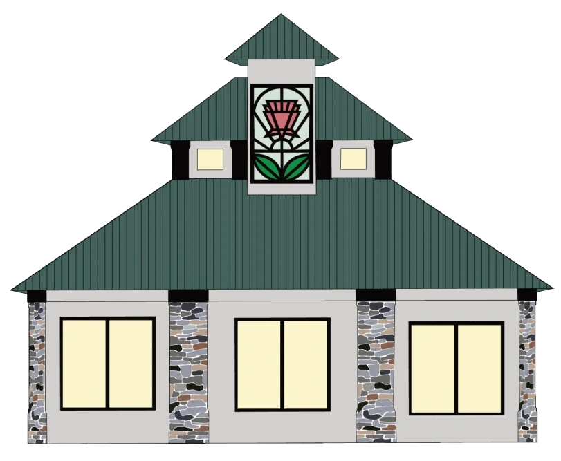
I was solely responsible for creating the proposal’s building renderings. Each gave the team and client a clearer view of a different part of the proposed environment, from public-facing destinations to adaptable working spaces.
An adapted clubhouse envisioned as a place for art exhibitions, refreshments and community gathering.
An existing structure reimagined as modular studios and vendor spaces for working artists.
A clear arrival landmark to establish the identity of the proposed site.
We proposed dividing existing freight containers into six flexible studios, reducing the need for new construction materials and limiting waste while giving artists adaptable workspaces.
The four original building renderings communicate different approaches to adaptive reuse. Select any image to view the details.
04 / Visual development
The presentation developed across multiple formats. I produced exploratory building sketches and scale models alongside the final renderings, allowing others to examine proportions, details and the proposed transformations from different perspectives.
Tested architectural forms and exterior changes before committing to finished views.
Translated architectural ideas into concrete images for the client-facing proposal.
Represented key concepts three-dimensionally to communicate scale and structure.
05 / Research & budgeting
I helped research comparable arts venues, materials and suppliers while contributing to a preliminary cost worksheet. Our team contacted companies and obtained pricing quotes to inform the estimates. The figures below are historical concept costs, not present-day bids or approved project expenditures.
Original team estimate
$649,745.18Total across all seven categories in our original preliminary cost worksheet.
Share of total estimated cost
Every track represents the full $649,745.18 estimate (100%). Filled lengths show each category’s proportion of that total; the categories together account for 100%.
Original estimated amounts and the associated scope of each line item.
| Category | Included costs | Estimate |
|---|---|---|
| Parking lots & walkwaysConcrete and asphalt mixes | Concrete and asphalt mixes | $402,813.90 |
| Golf-cart pavilionPaint, roofing, garage doors | Paint, roofing, garage doors | $99,406.85 |
| GalleryPaint, roofing, stained glass, ramp and furnishings | Paint, roofing, stained glass, ramp and furnishings | $80,515.94 |
| Shipping-container studiosPaint, placement and electricity | Paint, placement and electricity | $46,812.14 |
| GroundskeepingLighting, seating and maintenance | Lighting, seating and maintenance | $11,040.00 |
| WarehousePaint | Paint | $7,836.15 |
| ElectricalPaint | Paint | $1,320.20 |
| Total | Archived student estimate | $649,745.18 |
Estimates transcribed from the archived proposal. The team obtained supplier quotes, but the underlying individual quote documents are no longer available for verification. These figures are not comparable to the current RoseArts development budget.
Florida Corporate Construction (concrete), J.L.C. Outdoors (landscaping), and Sherwin-Williams (paint). The surviving contact list does not identify which line-item figures came from which individual quotes.
Researched comparable arts venues and requested pricing from businesses to inform the team’s preliminary estimates. The proposal’s contact list identifies construction, landscaping and paint suppliers.
Planned to reuse existing freight containers for six artist studios, limiting new material needs and construction waste.
The team also addressed landscape maintenance, cleaning and care for outdoor sculptural works.
06 / Outcome
Our concept was not selected by the client. But responding to a real development opportunity taught me how research, rough financial planning and clearly presented deliverables support collaborative decisions.
I contributed to the team’s research and budget, while personally owning the sketches, renderings and models that helped make our ideas concrete.
This project connected exploratory research, preliminary budgeting and coordinated creative deliverables, experience that still informs how I approach complex projects today.
Three earlier projects that show how I translate a brief into a connected set of decisions, experiences, and tangible deliverables.
A real small-business identity, a responsive ordering prototype, and a concept-driven retail brand, selected for the planning and communication skills behind the work.
01 / Client project
A working brand, not just a logo
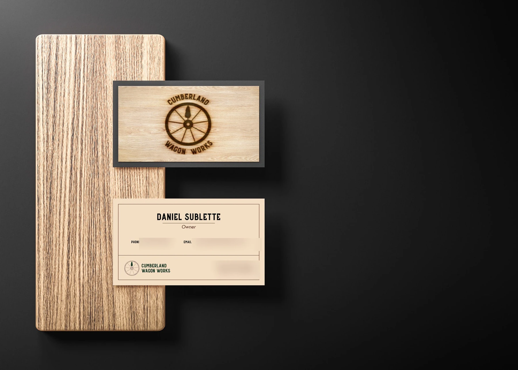
For a real small-business client, I created a logo family and visual identity direction for Cumberland Wagon Works. The work included a wagon-wheel mark, typography, a defined color palette, a wood-finish treatment, and business-card layouts.
The strongest part of this project is the connection between the individual pieces: a single identity needed to work as a stand-alone symbol, with the company name, and on practical business stationery.
Identify the business character and the visual language appropriate to its craft.
Bring marks, type, colors and surfaces into one coherent identity.
Adapt the identity into business-card layouts and multiple logo configurations.
Original research and project documentation established the direction before the design work.
Client research / Original intake survey
Before developing the identity, I created a brand questionnaire to understand the business, its audiences, and the practical settings where the work would appear. The client’s responses guided the concept selection and presentation.
The client connected the name to Kentucky’s Cumberland River Valley and traditional wood-and-steel wagon building.
The client identified the distinctive wooden wheel as an important authentic detail, reflected in the final mark.
The brief emphasized broad appeal, with initial promotion through word of mouth and craft shows.
Documented client process
I researched and drafted a written design agreement and prepared project invoices, defining the deliverables, client review expectations, payment stages and ownership terms. These documents show how I structured a professional engagement alongside the design work.
Early concepts laid the groundwork for the system that followed.
From brief to options
The original exploration considered different approaches to the wheel symbol, landscape reference and typography, then translated the selected direction into a practical logo family and business stationery.
Brand standards and business stationery applied the visual direction across practical formats.
02 / Digital experience
From brand refresh to product flow
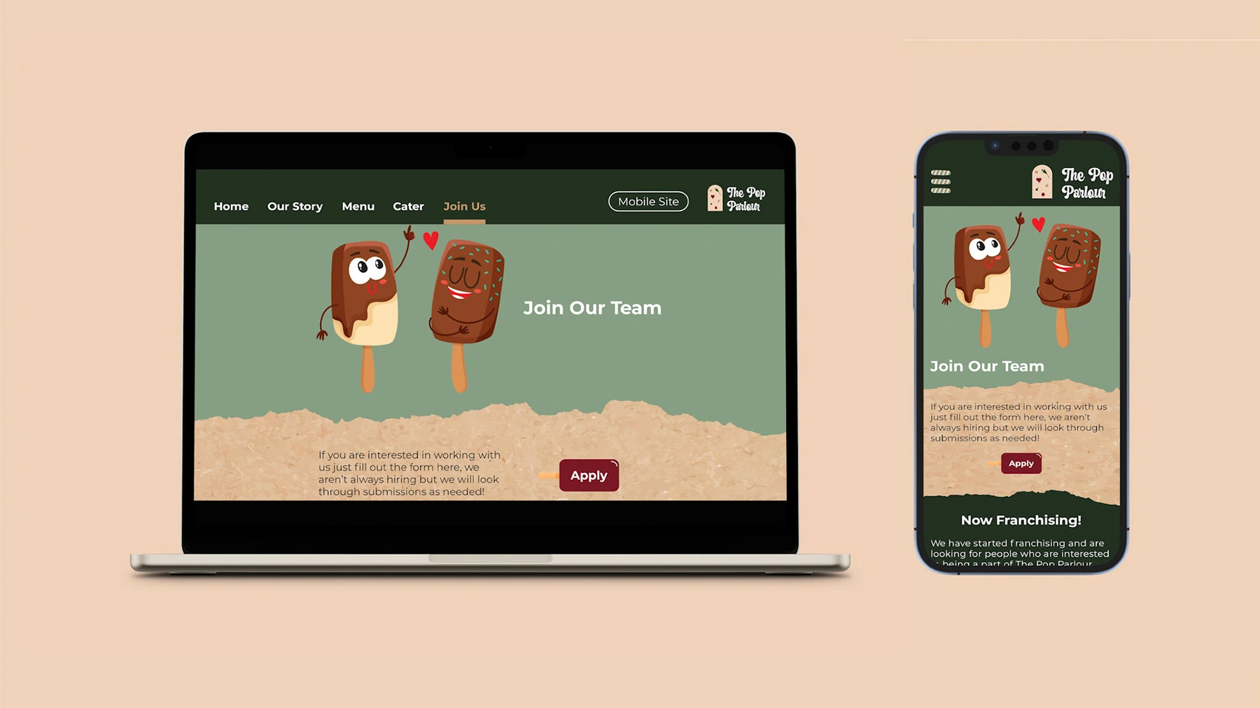
For this self-directed conceptual rebrand, I developed a new visual direction and a responsive website prototype for an existing gourmet-popsicle shop in Orlando.
The scope extended beyond a homepage: the prototype explored product browsing, a custom-popsicle ordering flow, ingredient identification, nutrition details, and checkout. That required the brand and the interface to support the same customer journey.
The interactive prototype documents the navigation and ordering flow beyond the static screens shown here.
This was a conceptual prototype, not a commissioned site launch. Its value is in structuring a digital experience around specific customer tasks and keeping multiple screens aligned.
03 / Integrated identity system
One identity across many surfaces
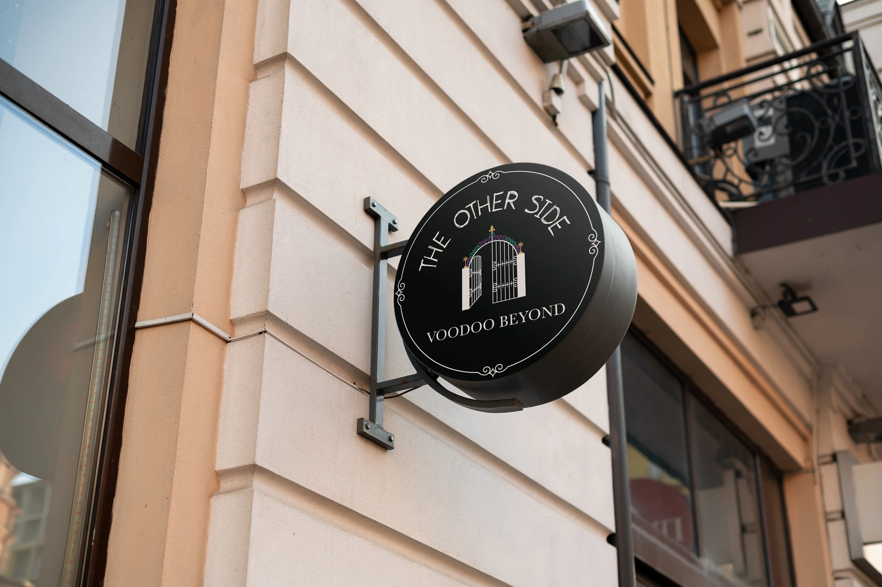
The Other Side was a fictional New Orleans-inspired retail concept. I developed a unified identity and packaging system, borrowing visual cues from the city's ironwork and cemetery architecture. The strongest outcomes were the environmental mockups and the styled product photography, which helped the concept feel like a cohesive retail launch rather than a set of isolated assignments.
The original work carried recurring imagery and typography across a projecting storefront sign, informational cards, opening-and-closing signage, packaging, and product mockups. Some packaging pieces were physically constructed from cardstock rather than left as screen-only artwork.
Use repeating graphic cues to establish the concept's distinct identity.
Adapt the same system to storefront, printed collateral and objects.
Carry digital designs into mockups and hand-assembled packages.
The common thread
These projects are deliberately secondary to my larger production and community case studies. Together, they show why I can work comfortably between a creative brief and its execution: understanding the deliverables, organizing a consistent direction, and thinking through how someone will actually use the result.